


@mostapha-yasserSubmitted 5 months ago
Latest solutions
Responsive Four Card Layout Using Html and CSs
Submitted 6 months agoHow can I improve the website using Sass and strengthen my responsive skills? What universal code can I always put on my websites to better my responsiveness in the future?
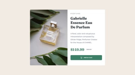
Responsive Product Preview Card
Submitted 6 months agoCan I get more responsive websites hints, cause I'm really struggling with it :(
Responsive Recipe Webpage using HTML and CSS
Submitted 6 months agoI would like help with my responsiveness on websites
Latest comments
- @EgnodiaPosted 5 months ago
Nice job! But fortunately I can't help you to improve, since I am also stuck on responsive designing
0 - @AndresLamarSubmitted 6 months ago@EgnodiaPosted 6 months ago
Hey, fantastic effort on this! You’re really nailing it. Just a few things I noticed that could make it even better…
For future project, You could download and host your own fonts using @font-face improves website performance by reducing external requests, provides more control over font usage, ensures consistency across browsers, enhances offline availability, and avoids potential issues if third-party font services become unavailable. A place to get .woff2 fonts
I think you can benefit from using a naming convention like BEM (Block, Element, Modifier) is beneficial because it makes your CSS more organized, readable, and easier to maintain. BEM helps you clearly understand the purpose of each class, avoid naming conflicts, and create reusable components, leading to a more scalable codebase. For more details BEM
Amazing work using the at using SaSS.
I hope you found this advice helpful! Keep up the great work, You’re doing amazing, and I can’t wait to see what you create next. Happy coding! 🚀
0 - @SayedM009Submitted 6 months ago@EgnodiaPosted 6 months ago
Hey, fantastic effort on this! You’re really nailing it. Just a few things I noticed that could make it even better…
For future project, You could download and host your own fonts using @font-face improves website performance by reducing external requests, provides more control over font usage, ensures consistency across browsers, enhances offline availability, and avoids potential issues if third-party font services become unavailable. Place to get .woff2 fonts
Using a full modern CSS reset is beneficial because it removes default browser styling, creating a consistent starting point for your design across all browsers. It helps avoid unexpected layout issues and makes your styles more predictable, ensuring a uniform appearance on different devices and platforms, check out this site for a Full modern reset
I think you can benefit from using a naming convention like BEM (Block, Element, Modifier) is beneficial because it makes your CSS more organized, readable, and easier to maintain. BEM helps you clearly understand the purpose of each class, avoid naming conflicts, and create reusable components, leading to a more scalable codebase. For more details BEM ,
I hope you found this advice helpful! Keep up the great work, You’re doing amazing, and I can’t wait to see what you create next. Happy coding! 🚀
1 - @LonlysoftSubmitted 6 months agoWhat are you most proud of, and what would you do differently next time?
Oh, That was sure an simple-complex card. I finally used the width media query. My experience with media queries were the
What challenges did you encounter, and how did you overcome them?screen only and (orientation: portrait). So I'm kinda proud that the media query just worked in first try.I spent a long time trying to import the font locally, but I couldn't do it. in the end I went to Google Fonts and got the link to import it through their API. I don't know what happened to the file. font-face syntax isn't wrong and the path is right.
I also spend some time in the
list-style-typebecause the The design image didn't let me know whether the marker type was square or circle. I chose circle just because I thought they were a little too round to be squares.Ordered and unordered list padding also made me scratch my head a little because of the spacing between markers and text. It's just another try and error situation, but I had spent more time since I'm not used to adding spacing to a list. Oh and by the way I couldn't figure out how to center the markers in the vertical center of the element. I made some reasearch and yet don't know how to do it.
I used border-bottom for the little almost imperceptible line diving the topics. I could have used ::before, ::after or even an decoration div for that. It can be an alternative but I think those are more for overlapping elements and animations (which is not the case here).
What specific areas of your project would you like help with?How to make the markers center in the y-axis of the list item text? I thought using flexbox like in the table, but I don't think that's the right way.
@EgnodiaPosted 6 months agoGreat work, but you should use max-width for instead of width for your percentage sizing in your code from now on. :)
1 - @rishavbarman-devSubmitted 7 months ago@EgnodiaPosted 6 months ago
Amazing job on the design of this challenge !!!
There is one issue you should fix and that is the accessibility part of this challenge :
- Make sure to add the main tag to your projects.
- Use the meta description tag in all your projects as well.
Marked as helpful0 - @Davzp1980Submitted 6 months ago@EgnodiaPosted 6 months ago
Amazing job with this! You’re making fantastic progress. Here are some small tweaks that might take your solution to the next level…
This does not matter that much at this stage but something to be mindful of for SEO(Search Engine Optimisation), <meta> description tag missing that helps search engine determine what the page is about, Something like this <meta name="description" content="description goes here" />
Using rem or em units in @media queries is better than px because they are relative units that adapt to user settings, like their preferred font size. This makes your design more responsive and accessible, ensuring it looks good on different devices and respects user preferences.
Using a full modern CSS reset is beneficial because it removes default browser styling, creating a consistent starting point for your design across all browsers. It helps avoid unexpected layout issues and makes your styles more predictable, ensuring a uniform appearance on different devices and platforms, check out this site for a Full modern reset
You’re doing fantastic! I hope these tips help you as you continue your coding journey. Stay curious and keep experimenting—every challenge is an opportunity to learn. Have fun, and keep coding with confidence!
0