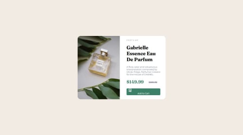
Not Found
Not Found
Not Found
Not Found
Not Found
Not Found
Not Found
Not Found
Not Found
Not Found
Request path contains unescaped characters
Not Found
Not Found
Not Found
Not Found
Not Found
Not Found
Not Found

Submitted

Responsive Product Preview Card

Egnodia 70

@Egnodia

Desktop design screenshot for the Product preview card component coding challenge

This is a solution for...

  • HTML
  • CSS
1newbie
View challenge

Design comparison


SolutionDesign

Solution retrospective


What specific areas of your project would you like help with?

Can I get more responsive websites hints, cause I'm really struggling with it :(

Community feedback

@Lonlysoft

Posted

You did a pretty well job in desktop! There's still some stuff like the icon positioning and the hover on the button, but those can be resolved easily.

There are a lot of responsive website hints, so it would be better if you say what you're more struggling with so the help would be more precise. But seeing your code I might have noticed some stuff that might had been difficult to you:

If you're wondering how to do the image switch for mobile and desktop, in HTML you can use the <picture> tag. It might sounds like a more complex tag, but it's used to change the image according to a media query statement. Example:

<picture>
    <source media = "(max-width: 23em)" srcset = "img.png"/>
    <img src = "img2.png"/>
</picture>
  • You can add more than one source tag if you need to.

The mobile design you can do it by using the flex-direction: column in the flexbox container and appliyng the proper styles on the media query.

I think this is the better option here since you used flexbox.

Also, I see you tried to test media queries, but nothing might have happened. The issue is that the mobile width isn't 375rem. (The font size in the root isn't 1px.) And since the font size is 16px you actually are appling the media query to a screen which width is between 6000px and 23040px. You need to convert 'px' to 'em' in order to get the media query interval right.

Hope those hints help.

Marked as helpful

0

Please log in to post a comment

Log in with GitHub
Discord logo

Join our Discord community

Join thousands of Frontend Mentor community members taking the challenges, sharing resources, helping each other, and chatting about all things front-end!

Join our Discord