Design comparison
Solution retrospective
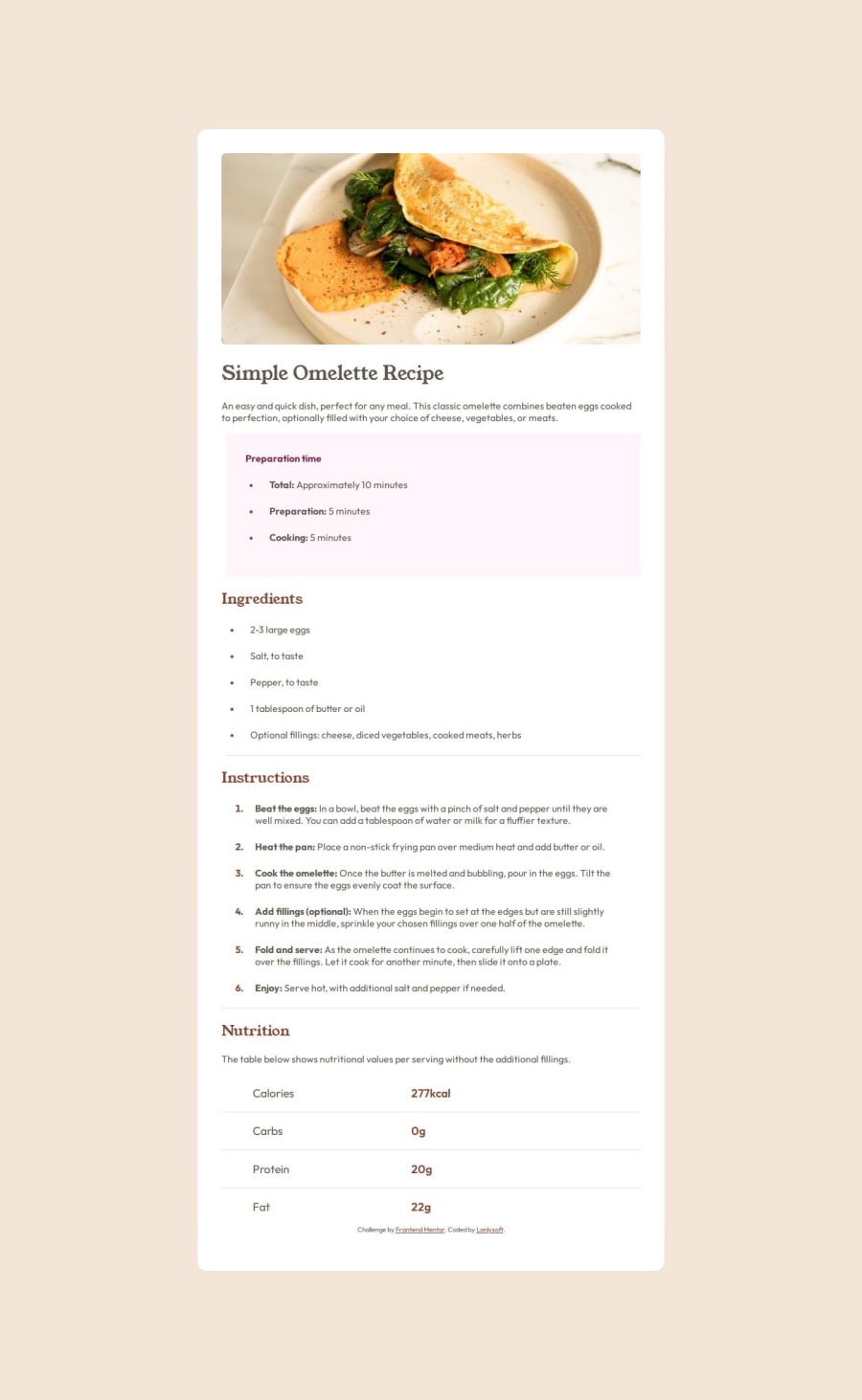
Oh, That was sure an simple-complex card. I finally used the width media query. My experience with media queries were the screen only and (orientation: portrait). So I'm kinda proud that the media query just worked in first try.
I spent a long time trying to import the font locally, but I couldn't do it. in the end I went to Google Fonts and got the link to import it through their API. I don't know what happened to the file. font-face syntax isn't wrong and the path is right.
I also spend some time in the list-style-type because the The design image didn't let me know whether the marker type was square or circle. I chose circle just because I thought they were a little too round to be squares.
Ordered and unordered list padding also made me scratch my head a little because of the spacing between markers and text. It's just another try and error situation, but I had spent more time since I'm not used to adding spacing to a list. Oh and by the way I couldn't figure out how to center the markers in the vertical center of the element. I made some reasearch and yet don't know how to do it.
I used border-bottom for the little almost imperceptible line diving the topics. I could have used ::before, ::after or even an decoration div for that. It can be an alternative but I think those are more for overlapping elements and animations (which is not the case here).
What specific areas of your project would you like help with?How to make the markers center in the y-axis of the list item text? I thought using flexbox like in the table, but I don't think that's the right way.
Community feedback
- P@StroudyPosted 6 months ago
@Lonlysoft, I’d like to provide some feedback. In past challenges, I noticed you haven't engaged or responded when solutions were submitted. Networking and actively engaging with the community are essential, and I highly encourage you to embrace these practices. They can greatly enhance collaboration and growth.
1 - @EgnodiaPosted 6 months ago
Great work, but you should use max-width for instead of width for your percentage sizing in your code from now on. :)
1
Please log in to post a comment
Log in with GitHubJoin our Discord community
Join thousands of Frontend Mentor community members taking the challenges, sharing resources, helping each other, and chatting about all things front-end!
Join our Discord

