your opinion is important for me, thank you all
Denis
@DenisShkarinovAll comments
- @ruamaziSubmitted over 1 year ago@DenisShkarinovPosted over 1 year ago
Hello. Look, if u a write, for example, days more then 31 and then push button - nothing happens. User should see errors under the fields.
1 - @Jolijn0101Submitted almost 2 years ago
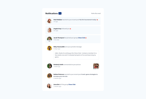
Today I finished my notifications-page. I have doubts about three things:
-
It was difficult to align the elements in my header element. Now I used flex box and gave the p element a width of 90%. Is there a better solution?
-
I had problems recreating the design in the right size. The font-size looked to big on a 375px device to look exactly like the design. After I changed it to a 425px device everything fitted in to place.
-
I made the notifications toggle to read individually ass well as the 'mark all ass read link'. Was it supposed to let it function only on the 'mark all ass read' link?
If you have any constructive criticism please feel free to let me know.
@DenisShkarinovPosted almost 2 years agoHello!
- When you click on the button "Mark all as read" you should reset styles on red rounds (maybe, this is label of new notification);
- In mobile version text is huge and if I were you did it smaller
- In <Header> I see that you are using flexbox and tag p have 90% of width. For what? You can wrap <h1> and counter in one <div> and <p> in another and then you can use property of flex justify-content: space-between
Do you use perfect pixel? Overall a job well done :)
Marked as helpful0 -
- @Queen-codesSubmitted almost 4 years ago@DenisShkarinovPosted almost 4 years ago
Excuse me, but it's not a landing page. it's just a testimonial's section made with a grid. And your version is not good for tablets. You can check it resizing browser's window. But you did a good job.
P.S. Sorry for my bad English. :)
0


