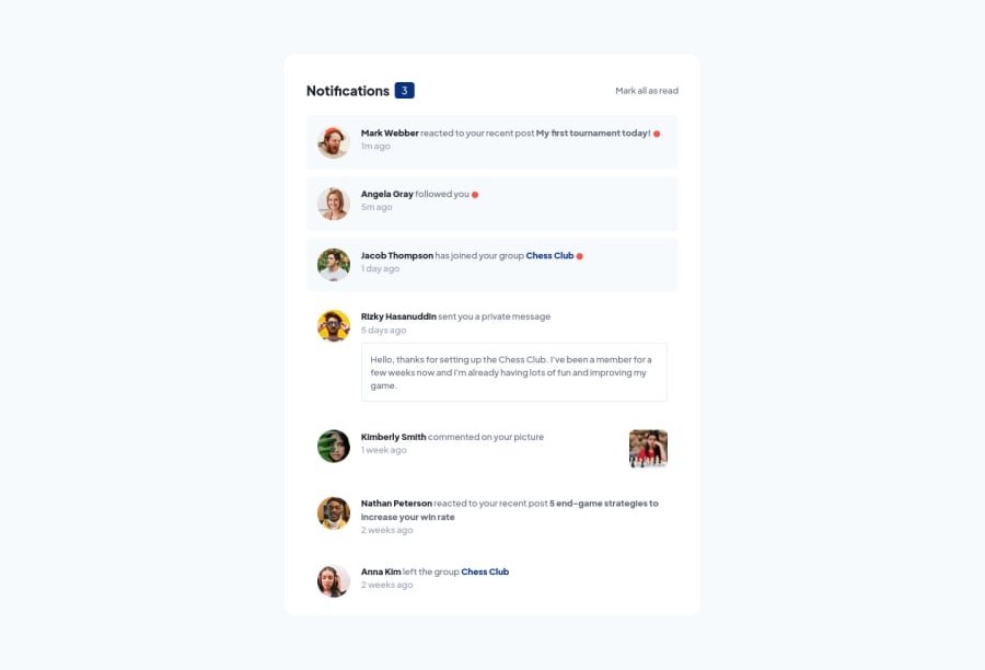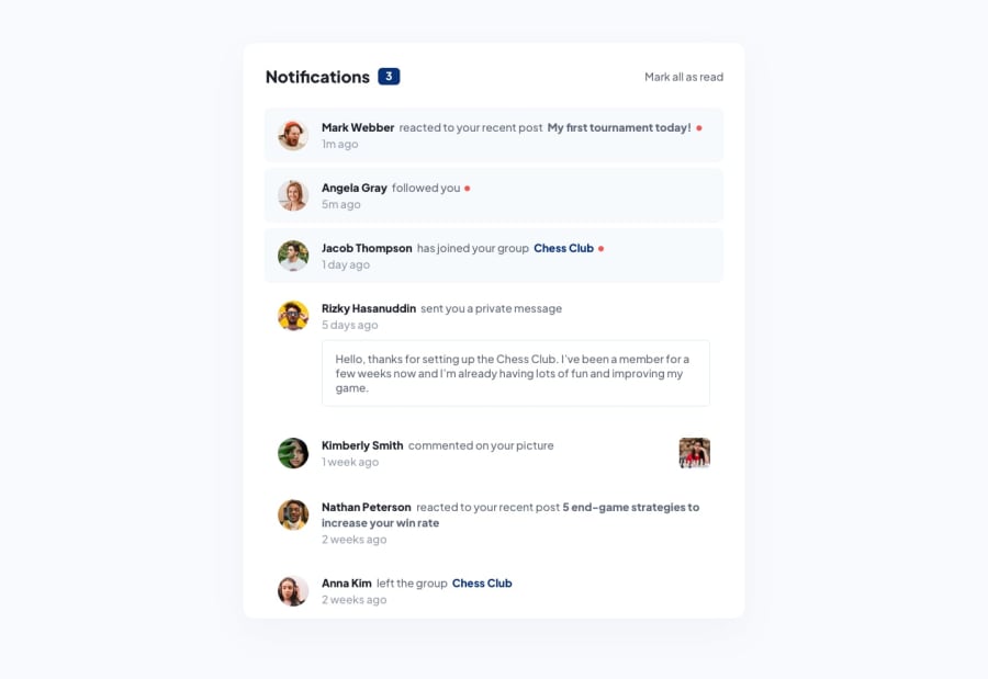
notifications-page with HTML, CSS and Javascript
Design comparison
Solution retrospective
Today I finished my notifications-page. I have doubts about three things:
-
It was difficult to align the elements in my header element. Now I used flex box and gave the p element a width of 90%. Is there a better solution?
-
I had problems recreating the design in the right size. The font-size looked to big on a 375px device to look exactly like the design. After I changed it to a 425px device everything fitted in to place.
-
I made the notifications toggle to read individually ass well as the 'mark all ass read link'. Was it supposed to let it function only on the 'mark all ass read' link?
If you have any constructive criticism please feel free to let me know.
Community feedback
- @DenisShkarinovPosted about 2 years ago
Hello!
- When you click on the button "Mark all as read" you should reset styles on red rounds (maybe, this is label of new notification);
- In mobile version text is huge and if I were you did it smaller
- In <Header> I see that you are using flexbox and tag p have 90% of width. For what? You can wrap <h1> and counter in one <div> and <p> in another and then you can use property of flex justify-content: space-between
Do you use perfect pixel? Overall a job well done :)
Marked as helpful0P@Jolijn0101Posted about 2 years ago@DenisShkarinov
Thank you for your feedback. It was very helpful. I modified my code and downloaded perfect pixel. It seems like a very useful extension. Can't wait to try it out on my next project. Thank you for the recommendation.
0
Please log in to post a comment
Log in with GitHubJoin our Discord community
Join thousands of Frontend Mentor community members taking the challenges, sharing resources, helping each other, and chatting about all things front-end!
Join our Discord
