Skip to content
Learning paths
Challenges
Solutions
Articles
Unlock Pro
Log in with GitHub
Profile
Overview
Solutions
8
Comments
3
ChrisEski
@ChrisEski
Follow
All solutions
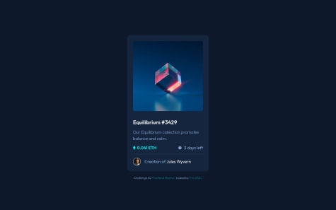
Card component using Next.js 13 with TailwindCSS
#next
#node
#tailwind-css
ChrisEski
•
110
Submitted almost 2 years ago
3 comments
4 likes
Product Card design using SASS for style nesting and file seperation
#sass/scss
ChrisEski
•
110
Submitted about 2 years ago
0 comments
2 likes
Pricing card using CSS Grid
ChrisEski
•
110
Submitted over 3 years ago
0 comments
2 likes
Landing Page with custom JS form validation
ChrisEski
•
110
Submitted over 3 years ago
0 comments
1 like
Landing page using Flexbox and JavaScript
ChrisEski
•
110
Submitted over 3 years ago
1 comment
3 likes
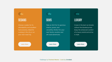
Services cards layout using CSS Grid
#bem
ChrisEski
•
110
Submitted over 3 years ago
1 comment
1 like
Mobile-first Card Preview
ChrisEski
•
110
Submitted over 3 years ago
1 comment
1 like
3-column preview card using CSS flexbox
ChrisEski
•
110
Submitted over 3 years ago
0 comments
1 like
Oops! 😬
You need to be logged in before you can do that.
Log in with GitHub
Oops! 😬
You need to be logged in before you can do that.
Log in with GitHub
Oops! 😬
You need to be logged in before you can do that.
Log in with GitHub
Oops! 😬
You need to be logged in before you can do that.
Log in with GitHub
Oops! 😬
You need to be logged in before you can do that.
Log in with GitHub
Oops! 😬
You need to be logged in before you can do that.
Log in with GitHub
Oops! 😬
You need to be logged in before you can do that.
Log in with GitHub
Oops! 😬
You need to be logged in before you can do that.
Log in with GitHub
Oops! 😬
You need to be logged in before you can do that.
Log in with GitHub
Oops! 😬
You need to be logged in before you can do that.
Log in with GitHub
Oops! 😬
You need to be logged in before you can do that.
Log in with GitHub
Oops! 😬
You need to be logged in before you can do that.
Log in with GitHub
Oops! 😬
You need to be logged in before you can do that.
Log in with GitHub
Oops! 😬
You need to be logged in before you can do that.
Log in with GitHub
Oops! 😬
You need to be logged in before you can do that.
Log in with GitHub
Oops! 😬
You need to be logged in before you can do that.
Log in with GitHub
Oops! 😬
You need to be logged in before you can do that.
Log in with GitHub
