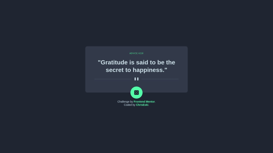
Design comparison
Community feedback
- @0xabdulkhaliqPosted over 1 year ago
Hello there 👋. Congratulations on successfully completing the challenge! 🎉
- I have other recommendations regarding your code that I believe will be of great interest to you.
BODY MEASUREMENTS 📐:
- The
h-screen
utility class is used to defineheight: 100vh
, But we want to usemin-height: 100vh
forbody
instead ofheight: 100vh
. Setting theheight: 100vh
may result in the component being cut off on smaller screens, such as mobile devices in landscape orientation.
- For example; if we set
height: 100vh
then thebody
will have100vh
height no matter what. Even if the content spans more than100vh
.
- But if we set
min-height: 100vh
then thebody
will start at100vh
, if the content pushes thebody
beyond100vh
it will continue growing. However if you have content that takes less than100vh
it will still take100vh
in space.
- So we want to use
min-h-screen
utility class to definemin-height: 100vh
.
I hope you find this helpful 😄 Above all, the solution you submitted is great !
Happy coding!
Marked as helpful1@ChrisEskiPosted over 1 year ago@0xAbdulKhalid Thank you for your advice! I will have that in mind for my future projects! 💪
0 - @Kamlesh0007Posted over 1 year ago
Hey there! I noticed that your React app can take some time to load, and it might be a good idea to add a loader to improve the user experience.
To add a loader, you can create a new component loader and use it to display a loading animation until your content has loaded. You can then conditionally render your Loader component based on the state of your app Bro do use loading text use some icons for loading screen it will be best for ur design and more effective than a message
1@ChrisEskiPosted over 1 year ago@Kamlesh0007 Thank you very much, I try to implenent this feature in my next project. I try to learn Next.js 13 step by step :)
0@Kamlesh0007Posted over 1 year ago@ChrisEski yes bro and if possible u can increase the height of container and should i send u how to add loader in next js
0 - @johnphillipsdevPosted over 1 year ago
Great job on your solution! To enhance the accuracy of your design, consider utilizing the dynamic values from Tailwind CSS JIT (Just-in-Time) mode.
By leveraging the JIT mode's arbitrary value support, you can achieve precise measurements and better align your solution with the design specifications. You can learn more about this feature in the Tailwind CSS documentation.
For example, to adjust the letter-spacing and make it more accurate to the design, you can use dynamic values. Here's a code snippet that demonstrates this:
<h1 class="text-accent font-normal... tracking-[4px]">ADVICE #218</h1>
Happy coding @ChrisEski!
0
Please log in to post a comment
Log in with GitHubJoin our Discord community
Join thousands of Frontend Mentor community members taking the challenges, sharing resources, helping each other, and chatting about all things front-end!
Join our Discord