@umutcankocamisSubmitted 10 months ago
Hello Community, I couldn't change the background color of the image. Can someone tell me why I can't change it?

Hello Community, I couldn't change the background color of the image. Can someone tell me why I can't change it?
Apply background-blend-mode: multiply to your card holding the image. That way the card background-color will be blended with the image.
Hi there,
In this project I have learned a lot, as I'm rather new to JavaScript. In this project I learned a ton about selectors in JavaScript such as nextElementSibling or children[i].
I had a lot of fun building this project. Feedback would be appreciated! 😍
Nice work.
There is small problem with your transition though.
The transition effect you added will not come into play because the browser only recognizes where to start, that is height: 0, but doesn't know where to end it because of the height: max-content. It will transit smoothly if you could set a final max-height of say 8rem.
Feedback is welcome
Observations:
There are two images provided for this project. One for the desktop and the other for the mobile viewport.
You could easily switch between the two images using media query or picture and srcset combination.
Also the background-color applied on the image is a bit off because you just simply reduced the opacity of the background-color. To fix that you can blend the color of the background into the img color using background-blend-mode: multiply.
Hope this helps.
Hello! I'm Daniel and this is my solution for this challenge! 😊
Very good project to polish HTML and CSS skills. It's quite hard to match the original design of these bigger landing pages without the design file. I enjoyed very much trying though.
If you have any suggestions on how I can improve this project, feel free to leave me a comment!
Feedback welcome 😊
Giving the image that purple color was quite a challenge, because it is originally black and white. I think the final result was good, though.
On this project you could improve it by using background-mix-blend-mode: multiply to match the project image color.
mix-blend-mode blends the background color with that of the image.
check it out here: https://call4julius.github.io/stats-preview-card-component/
I found it difficult to align the logo and the illustration-mockup. So I just didn't align them and I not sure if its fine. How did you aligned it?
To align the logo and the image, you can put all the content in one div and use padding to give the equal left spacing.
Hello! I'm Daniel and this is my 17th solution!
Try to use everything I've been learning these past few weeks. Javascript, Tailwind and SASS all together. Very simple but not that easy project.
If you have any insights or suggestions on how I can improve this project, please feel free to leave me a comment :)
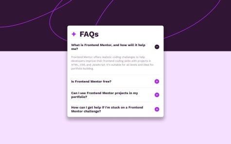
Why is it that clicking on the + sign makes your entire faqs container increase in size? It is increasing both in width and height.
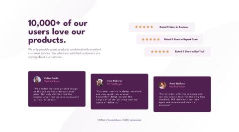
Hello, Front-end Mentor Community! I'm Daniel and this is my solution to Social Proof Section Challenge! 🚀
This was by far the most difficult challenge using CSS Grid. It's definitely the one that I learned the most from. If you wanna practice Grid, this is one of the best challenges to do so.
It took me many hours, but I managed to finish it.
If you have any suggestions on how I can improve it, please feel free to leave me a comment! I appreciate feedback.
I noticed this long line of selection:
body .principal .section02 .rating01, body .principal .section02 .rating02, body .principal .section02 .rating03{}
Since the aim was to select the various ratings, I would have just added rating class to each in the html mark-up.
Then writing the rating:hover like this too.
Nice code sir. You are really doing well.
Nice work. Very impressive.
There are two background images provided to be applied though.
🚀 Introducing my take on the Social Proof Section challenge at Frontend Mentor! 👾
TWEAKS: ✨ Witness the magic of hover effects 👨🔬 Join me on this coding journey to conquer HTML, CSS, and JS challenges. I'm crafting custom features and tweaks that inspire!
🎯😊Excited to receive your valuable feedback and advice.📌📌
Let's elevate our coding skills together! 🌟 #FrontendMentor #HTMLCSSJSChallenge #CodeJourney 🚀
Nice work sir. Please check and review my solution for this challenge. Your feedback is needed.
P.S: You forgot your background image.
Took a Tailwind course recently and tried to apply my new skills on this project. Took me more time than usual to finish it since it was my first time practicing Tailwind. This framework is crazy, you can finish a project without coding a single CSS line. Quite happy with the result.
Feel free to leave me a comment if you know how to improve this project.
Feedback is appreciated! 😊
I am yet to start learning tailwind css. I heard its a lot of fun. For the now i just want to get stronger with plain vanilla css.
P.S: What are the advantages of libraries like tailwind over the plain versions like css? I would like to have a feedback. Thanks in advance.
Neatly written code.
I was wondering why you declared html {font-size: 62.5%;}?
Also there are two images given: one form mobile display and the other for desktop display. It's suppose to change as you move from one screen size to the other.
That is the little detail you missed. Nice work 👍.