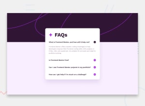
Design comparison
Solution retrospective
Hello! I'm Daniel and this is my 17th solution!
Try to use everything I've been learning these past few weeks. Javascript, Tailwind and SASS all together. Very simple but not that easy project.
If you have any insights or suggestions on how I can improve this project, please feel free to leave me a comment :)
Community feedback
- @Call4juliusPosted 11 months ago
Why is it that clicking on the + sign makes your entire faqs container increase in size? It is increasing both in width and height.
1@danielmrz-devPosted 11 months ago@Call4julius
What browser are you using? I use Google Chrome and it's not behaving like you said... strange 🤔
0 - @jhontriboykePosted 11 months ago
Sir this looks nice!, but there is a issue where the cursor over slightly on the bottom of the accordion, like there is a padding bottom. The area is not clickable but the cursor change, I try to disable pb-3 on <div class="question">.
0
Please log in to post a comment
Log in with GitHubJoin our Discord community
Join thousands of Frontend Mentor community members taking the challenges, sharing resources, helping each other, and chatting about all things front-end!
Join our Discord
