


@S1S4Submitted almost 2 years ago
I'm just a guy who loves to solve problems, and I see web development as a tool for doing so. I'm eager to learn and understand. Feel free to contact me and review my codes
I’m currently learning...Am currently learning react and i need someone to be accountable to ; a mentor perhaps
Latest solutions
- Submitted almost 2 years ago
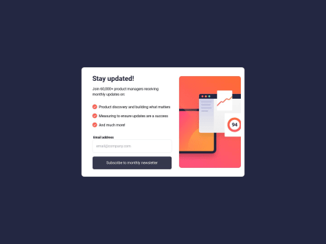
Newsletter sign-up form with success message
#accessibility#tailwind-css- HTML
- CSS
- JS
- Submitted almost 2 years ago
Responsive landing page for Manage using tailwindcss and vanilla js
#accessibility#tailwind-css#semantic-ui- HTML
- CSS
- JS
- Submitted almost 2 years ago
Expenses-chart-component using tailwindcss
#tailwind-css#accessibility- HTML
- CSS
- JS
Latest comments
- @BoyutifePosted almost 2 years ago
Hi Cesar Perez 👋. Congratulations on successfully completing the challenge! 🎉
HTML:🔖🔖
-
Great job on using the p tag in your content! I wanted to offer a suggestion that could help improve the accessibility of your page. Currently, it looks like you have p tag in your content, but it might be more helpful to use an h1 tag instead. This is because using an h1 tag as the main heading on your page can improve accessibility and make it easier for users to navigate your content.
-
In general, it's a good idea to use only one h1 tag on each page, followed by h2 and h3 tags to organize your content. This will not only help with accessibility, but also make it easier for search engines to understand the structure of your page.
-
So, my suggestion is to consider using an h1 tag as your main heading, followed by h2 and h3 tags as needed to organize your content. This will help improve the accessibility and usability of your page for all users.
-
Also, instead of using a div tag to wrap your content, you might consider using a main tag, which is more semantically appropriate for indicating the primary content of your webpage
 <main class="main-container">
    <div class="qr-container">
      <img src="./images/image-qr-code.png" alt="QR-code-image">
      <div class="content">
        <h1>Improve your front-end skills by building projects</h1>

        <p>Scan the QR code to visit Frontend Mentor and take your coding skills to the next level</p>
      </div>
    </div>
  </main>
STYLE: 🎨🎨
You considering using relative units like em and rem rather than fixed units like px for your styling because of the following :
-
Accessibility: Using relative units can improve accessibility for users who may need to increase the font size or zoom in on a web page. With relative units, the font and layout will adjust accordingly, making it easier for users to read and interact with the content.
-
Responsive design: Relative units can also make your design more responsive, as they allow your layout to adapt to different screen sizes and device types. This can be especially important for mobile devices, where screen sizes can vary significantly.
-
Consistency: Relative units can help maintain consistency across your design, as they ensure that fonts and layout elements are sized in proportion to each other. This can make your design look more polished and professional.
-
Scalability: Finally, using relative units can make your code more scalable and easier to maintain, as changes to font or layout sizes can be made in one place and affect the entire design.
-
In conclusion, to make your design more centralized and compact, you might consider setting a max-height and max-width property for your main container. This can help ensure that your content is displayed in a consistent and visually appealing manner, especially on smaller screens.
I hope these suggestions are helpful and will lead to an even better final product. Let me know if you have any further questions or need additional assistance!
HAPPY CODING
Marked as helpful1 -
- @roger-hopeSubmitted almost 2 years ago@BoyutifePosted almost 2 years ago
Hi roger-hope 👋. Congratulations on successfully completing the challenge! 🎉
HTML:🔖🔖
-
Great job on using the h3 tag in your content! I wanted to offer a suggestion that could help improve the accessibility of your page. Currently, it looks like you have h3 tag in your content, but it might be more helpful to users if you use an h1 tag instead. This is because using an h1 tag as the main heading on your page can improve accessibility and make it easier for users to navigate your content.
-
In general, it's a good idea to use only one h1 tag on each page, followed by h2 and h3 tags to organize your content. This will not only help with accessibility, but also make it easier for search engines to understand the structure of your page.
-
So, my suggestion is to consider using an h1 tag as your main heading, followed by h2 and h3 tags as needed to organize your content. This will help improve the accessibility and usability of your page for all users.
-
Also, instead of using a div tag to wrap your content, you might consider using a main tag, which is more semantically appropriate for indicating the primary content of your webpage
<main class="card"> <img src="images/image-qr-code.png" alt="qr-code-image"> <h1>Improve your front-end skills by building projects</h1> <p> Scan the QR code to visit Frontend Mentor and take your coding skills to the next level</p> </main>- In conclusion, to make your design more centralized and compact, you might consider setting a max-height and max-width property for your main container. This can help ensure that your content is displayed in a consistent and visually appealing manner, especially on smaller screens.
I hope these suggestions are helpful and will lead to an even better final product. Let me know if you have any further questions or need additional assistance!
HAPPY CODING
0 -
- @AhmetFMSubmitted almost 2 years ago@BoyutifePosted almost 2 years ago
Hi Ahmet Furkan Meriç 👋. Congratulations on successfully completing the challenge! 🎉
Great Job
HTML:🔖🔖
-
Great job on using the h3 tag in your content! I wanted to offer a suggestion that could help improve the accessibility of your page. Currently, it looks like you have h3 tag in your content, but it might be more helpful to users if you use an h1 tag instead. This is because using an h1 tag as the main heading on your page can improve accessibility and make it easier for users to navigate your content.
-
In general, it's a good idea to use only one h1 tag on each page, followed by h2 and h3 tags to organize your content. This will not only help with accessibility, but also make it easier for search engines to understand the structure of your page.
-
So, my suggestion is to consider using an h1 tag as your main heading, followed by h2 and h3 tags as needed to organize your content. This will help improve the accessibility and usability of your page for all users.
-
Also, instead of using a div tag to wrap your content, you might consider using a main tag, which is more semantically appropriate for indicating the primary content of your webpage
 <main class="card">
      <img src="images/image-qr-code.png" alt="qr-code-image">
      <h1>Improve your front-end skills by building projects</h1>
       <p> Scan the QR code to visit Frontend Mentor and take your coding skills to the next level</p>
    </main>
STYLE: 🎨🎨
You considering using relative units like em and rem rather than fixed units like px for your styling because of the following :
-
Accessibility: Using relative units can improve accessibility for users who may need to increase the font size or zoom in on a web page. With relative units, the font and layout will adjust accordingly, making it easier for users to read and interact with the content.
-
Responsive design: Relative units can also make your design more responsive, as they allow your layout to adapt to different screen sizes and device types. This can be especially important for mobile devices, where screen sizes can vary significantly.
-
Consistency: Relative units can help maintain consistency across your design, as they ensure that fonts and layout elements are sized in proportion to each other. This can make your design look more polished and professional.
-
Scalability: Finally, using relative units can make your code more scalable and easier to maintain, as changes to font or layout sizes can be made in one place and affect the entire design.
-
In conclusion, to make your design more centralized and compact, you might consider setting a max-height and max-width property for your main container. This can help ensure that your content is displayed in a consistent and visually appealing manner, especially on smaller screens.
I hope these suggestions are helpful and will lead to an even better final product. Let me know if you have any further questions or need additional assistance!
HAPPY CODING
0 -
- @Stano153Submitted almost 2 years ago@BoyutifePosted almost 2 years ago
Hi Stano 👋. Congratulations on successfully completing the challenge! 🎉
HTML:🔖🔖
-
Great job on using the h1 tag in your content! I wanted to offer a suggestion that could help improve the accessibility of your page. Currently, it looks like you have multiple h1 tags in your content, but it might be more helpful to users if you use only an h1 tag instead. This is because using an h1 tag as the main heading on your page can improve accessibility and make it easier for users to navigate your content.
-
In general, it's a good idea to use only one h1 tag on each page, followed by h2 and h3 tags to organize your content. This will not only help with accessibility, but also make it easier for search engines to understand the structure of your page.
-
So, my suggestion is to consider using an h1 tag as your main heading, followed by h2 and h3 tags as needed to organize your content. This will help improve the accessibility and usability of your page for all users.
I hope these suggestions are helpful and will lead to an even better final product. Let me know if you have any further questions or need additional assistance!
HAPPY CODING
Marked as helpful0 -
- @MhherceSubmitted almost 2 years ago@BoyutifePosted almost 2 years ago
Hi OKORIE OKORO MERCY 👋. Congratulations on successfully completing the challenge! 🎉
HTML:🔖🔖
-
Great job on using the h5 tag in your content! I wanted to offer a suggestion that could help improve the accessibility of your page. Currently, it looks like you have h5 tag in your content, but it might be more helpful to users if you use an h1 tag instead. This is because using an h1 tag as the main heading on your page can improve accessibility and make it easier for users to navigate your content.
-
In general, it's a good idea to use only one h1 tag on each page, followed by h2 and h3 tags to organize your content. This will not only help with accessibility, but also make it easier for search engines to understand the structure of your page.
-
So, my suggestion is to consider using an h1 tag as your main heading, followed by h2 and h3 tags as needed to organize your content. This will help improve the accessibility and usability of your page for all users.
-
Also, instead of using a div tag to wrap your content, you might consider using a main tag, which is more semantically appropriate for indicating the primary content of your webpage
 <main class="page">
      <img src="images/image-qr-code.png" alt="qr-code-image">
      <h1>Improve your front-end skills by building projects</h1>
       <p> Scan the QR code to visit Frontend Mentor and take your coding skills to the next level</p>
    </main>
STYLE: 🎨🎨
You considering using relative units like em and rem rather than fixed units like px for your styling because of the following :
-
Accessibility: Using relative units can improve accessibility for users who may need to increase the font size or zoom in on a web page. With relative units, the font and layout will adjust accordingly, making it easier for users to read and interact with the content.
-
Responsive design: Relative units can also make your design more responsive, as they allow your layout to adapt to different screen sizes and device types. This can be especially important for mobile devices, where screen sizes can vary significantly.
-
Consistency: Relative units can help maintain consistency across your design, as they ensure that fonts and layout elements are sized in proportion to each other. This can make your design look more polished and professional.
-
Scalability: Finally, using relative units can make your code more scalable and easier to maintain, as changes to font or layout sizes can be made in one place and affect the entire design.
-
In conclusion, to make your design more centralized and compact, you might consider setting a max-height and max-width property for your main container. This can help ensure that your content is displayed in a consistent and visually appealing manner, especially on smaller screens.
I hope these suggestions are helpful and will lead to an even better final product. Let me know if you have any further questions or need additional assistance!
HAPPY CODING
0 -
- @who-whySubmitted almost 2 years ago@BoyutifePosted almost 2 years ago
Hi KISHOR JHA 👋. Congratulations on successfully completing the challenge! 🎉
HTML:🔖🔖
-
Great job on using the h3 tag in your content! I wanted to offer a suggestion that could help improve the accessibility of your page. Currently, it looks like you have h3 tag in your content, but it might be more helpful to users if you use an h1 tag instead. This is because using an h1 tag as the main heading on your page can improve accessibility and make it easier for users to navigate your content.
-
In general, it's a good idea to use only one h1 tag on each page, followed by h2 and h3 tags to organize your content. This will not only help with accessibility, but also make it easier for search engines to understand the structure of your page.
-
So, my suggestion is to consider using an h1 tag as your main heading, followed by h2 and h3 tags as needed to organize your content. This will help improve the accessibility and usability of your page for all users.
-
Also, instead of using a div tag to wrap your content, you might consider using a main tag, which is more semantically appropriate for indicating the primary content of your webpage
 <main class="card">
      <img src="images/image-qr-code.png" alt="qr-code-image">
      <h1>Improve your front-end skills by building projects</h1>
       <p> Scan the QR code to visit Frontend Mentor and take your coding skills to the next level</p>
    </main>
STYLE: 🎨🎨
You considering using relative units like em and rem rather than fixed units like px for your styling because of the following :
-
Accessibility: Using relative units can improve accessibility for users who may need to increase the font size or zoom in on a web page. With relative units, the font and layout will adjust accordingly, making it easier for users to read and interact with the content.
-
Responsive design: Relative units can also make your design more responsive, as they allow your layout to adapt to different screen sizes and device types. This can be especially important for mobile devices, where screen sizes can vary significantly.
-
Consistency: Relative units can help maintain consistency across your design, as they ensure that fonts and layout elements are sized in proportion to each other. This can make your design look more polished and professional.
-
Scalability: Finally, using relative units can make your code more scalable and easier to maintain, as changes to font or layout sizes can be made in one place and affect the entire design.
-
In conclusion, to make your design more centralized and compact, you might consider setting a max-height and max-width property for your main container. This can help ensure that your content is displayed in a consistent and visually appealing manner, especially on smaller screens.
I hope these suggestions are helpful and will lead to an even better final product. Let me know if you have any further questions or need additional assistance!
HAPPY CODING
0 -


