

Design comparison

Solution retrospective
created qr code web page using html css
Community feedback
- @HassiaiPosted over 1 year ago
Replace div class="card"> with the main tag and <h3> with <h1> to make the content/page accessible. click here for more on web-accessibility and semantic html
Every html must have <h1> to make it accessible. Always begin the heading of the html with <h1> tag wrap the sub-heading of <h1> in <h2> tag, wrap the sub-heading of <h2> in <h3> this continues until <h6>, never skip a level of a heading.
Give the alt attribute in the img a value. The value of the alt attribute is the description of the image. For decorative images like icons, there is no need to give it an alt value, for more on alt attribute Click here.
For a responsive content, replace the width in .card with max-width.
Give h1 and p the same font-size of 15px which is 0.9375rem, text-align: center, the same margin-left, margin-right and margin-top values. Give p a margin bottom value and a font-color of hsl(220, 15%, 55%); for the faded color.
The body has a wrong background-color, give it a background-color of light-gray. Use the colors and font-family that were given in the styleguide.md found in the zip folder you downloaded.
Use relative units like rem or em as unit for the padding, margin, width values and preferably rem for the font-size values, instead of using px which is an absolute unit. For more on CSS units Click here and here
Hope am helpful.
Well done for completing this challenge. HAPPY CODING
0 - @BoyutifePosted over 1 year ago
Hi KISHOR JHA 👋. Congratulations on successfully completing the challenge! 🎉
HTML:🔖🔖
-
Great job on using the h3 tag in your content! I wanted to offer a suggestion that could help improve the accessibility of your page. Currently, it looks like you have h3 tag in your content, but it might be more helpful to users if you use an h1 tag instead. This is because using an h1 tag as the main heading on your page can improve accessibility and make it easier for users to navigate your content.
-
In general, it's a good idea to use only one h1 tag on each page, followed by h2 and h3 tags to organize your content. This will not only help with accessibility, but also make it easier for search engines to understand the structure of your page.
-
So, my suggestion is to consider using an h1 tag as your main heading, followed by h2 and h3 tags as needed to organize your content. This will help improve the accessibility and usability of your page for all users.
-
Also, instead of using a div tag to wrap your content, you might consider using a main tag, which is more semantically appropriate for indicating the primary content of your webpage
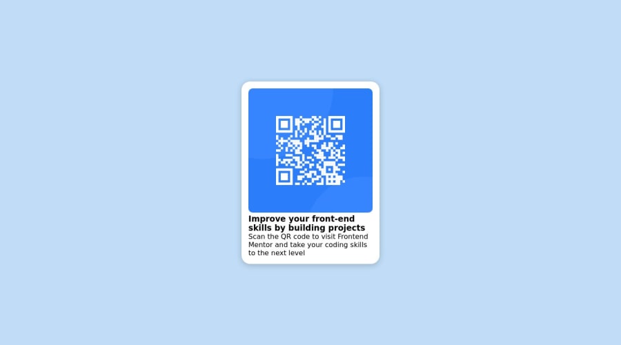
 <main class="card">
      <img src="images/image-qr-code.png" alt="qr-code-image">
      <h1>Improve your front-end skills by building projects</h1>
       <p> Scan the QR code to visit Frontend Mentor and take your coding skills to the next level</p>
    </main>
STYLE: 🎨🎨
You considering using relative units like em and rem rather than fixed units like px for your styling because of the following :
-
Accessibility: Using relative units can improve accessibility for users who may need to increase the font size or zoom in on a web page. With relative units, the font and layout will adjust accordingly, making it easier for users to read and interact with the content.
-
Responsive design: Relative units can also make your design more responsive, as they allow your layout to adapt to different screen sizes and device types. This can be especially important for mobile devices, where screen sizes can vary significantly.
-
Consistency: Relative units can help maintain consistency across your design, as they ensure that fonts and layout elements are sized in proportion to each other. This can make your design look more polished and professional.
-
Scalability: Finally, using relative units can make your code more scalable and easier to maintain, as changes to font or layout sizes can be made in one place and affect the entire design.
-
In conclusion, to make your design more centralized and compact, you might consider setting a max-height and max-width property for your main container. This can help ensure that your content is displayed in a consistent and visually appealing manner, especially on smaller screens.
I hope these suggestions are helpful and will lead to an even better final product. Let me know if you have any further questions or need additional assistance!
HAPPY CODING
0 -


Please log in to post a comment
Log in with GitHub
Join our Discord community
Join thousands of Frontend Mentor community members taking the challenges, sharing resources, helping each other, and chatting about all things front-end!
Join our Discord