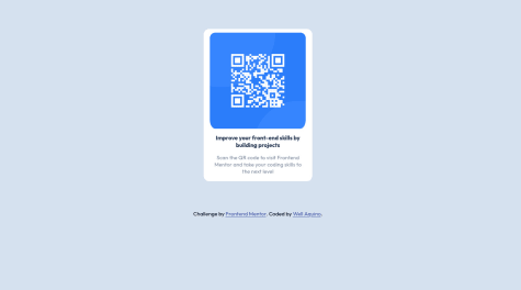
@vishnuvk15Submitted about 2 years ago
Feedback on my CSS is welcome. I am still learning.

Feedback on my CSS is welcome. I am still learning.
Congratulations @vishnuvk15! Your solution looks really nice, what I noticed is, your solution doesn't really need a media query @media, and can be further optimized to remove the unused CSS in the media query
Cheers and happy coding
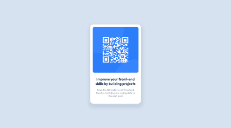
Build the project according to the information given in the challenge.
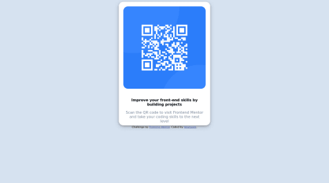
Congratulations @wellaquino on completing your first challenge, I think you did a good job. I just have a recommendation:
height: 100vh; width: 100%; display: flex to your body styling to center the main component.Cheers and happy coding
Congratulations @newtaves on completing your first challenge. Here are a few things i noticed:
height: 100vh; width: 100%; display: flex to your body styling to center the container..container to max-width: 300px to ensure a responsive look on smaller devices. Finally, I didn't see the need to specify height: 540pxCheers and happy coding
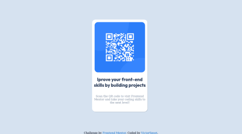
Hello @victorspoot, your solution to this challenge is really nice. Here are few things i noticed in your code:
.font-family and .font-weightAlso try .box-shadow: 0px 3px 15px rgba(0,0,0,0.2) it should give you a better result.
Cheers and Happy coding
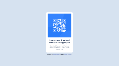
Congratulations @oussamaelhousni on completing your first challenge, your solution looks really nice. Here are a few things I noticed:
box-shadow to your .container div.Apart from these few things, your solution was spot on!! Cheers
Whoa!!! Nice work @AleksAus on your solution, it is truly amazing. The only thing I noticed is that you didn't add a box-shadow to your .main-component.
Cheers and happy coding!
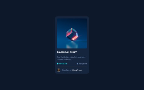
Congratulations on finishing the project, here is what i noticed:
.nft-card-container is a bit too highCheers😀