Ayoub RABIE
@AyoubrabiaeAll comments
- @AndresMpaSubmitted about 1 year ago@AyoubrabiaePosted about 1 year ago
Hey Andres,
Great job! 👏
I have an awesome idea to make things more fun and user-friendly. 🤗
Let's add a feature that lets users do calculations using their keyboard. 💻🖱️
Here's how to do it:
-
In your HTML code, for each button, add a data-key attribute with the corresponding keyboard key name (e.g., "1" for number keys, "Backspace" for the delete key).
-
Now, in your JavaScript, add an event listener like this:
// Listen for keyboard input addEventListener("keydown", (event) => handleKeyboardInput(event))- You can choose any name for the function; let's call it handleKeyboardInput. Here's the function with comments to explain:
// Function to handle keyboard input
function handleKeyboardInput(event) {
  // Find the button with the data-key attribute matching the pressed key
  const button = document.querySelector(`[data-key="${event.key}"]`);

  // If the button exists, trigger a click event on it
  if (button) {
    button.click();
  }
}
That's it! 🚀 Happy coding, and enjoy the improved functionality! If you have questions or need more help, feel free to ask. 😊💻🌟
1 -
- @DiegoLeonardoSotoSubmitted about 1 year ago
It was a little dificult the form validation but it works feedbacks are welcome
@AyoubrabiaePosted about 1 year agoHi there,
I see that you are doing a great job. I like the animations and live validation.
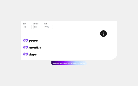
However, I've noticed a problem that needs to be addressed. The issue is that I can select a date in the future. For example, today is 10/24/2023, and I can choose 11/30/2023.
To solve this issue, you can implement a small validation to ensure that the selected month in the current year is not greater than the current month, and the day in the current month in the current year is not greater than the current day.
That's all. Happy coding!
Marked as helpful1 - @Khalid-R-SalisSubmitted about 1 year ago
plase review and drop corrections and sugestions
@AyoubrabiaePosted about 1 year agoYou're doing a great job, but you're just missing the font-family they provided.
I also recommend changing the color of the element under the number 76 out (of 100) to something like gray, or a color that matches the design.
Keep coding happily!
0 - @foeiieofSubmitted about 1 year ago
Can you suggest me to improve my code?
@AyoubrabiaePosted about 1 year agoHi,
I've reviewed your code and had a look at the preview of your app. I must say you're doing a great job!
However, I noticed a minor bug. You're performing checks for the day, the month, and the year, which is excellent. But when it comes to the year, you're checking if it falls between 1900 and 2100. You can improve this by checking if the year is between 1900 and the current year using
new Date().getFullYear(). This way, your code will remain valid over time.If you need any assistance, I'm here to help. Happy coding!
Marked as helpful1 - @sumaira10041Submitted about 1 year ago
Let me now if there is any mistake....
@AyoubrabiaePosted about 1 year agoHi,
I noticed that your app is doing a good job, but when I checked it, I noticed something. It's okay to be able to choose the current date, which can be normal sometimes (for someone born today 😅), but the problem is I can choose a date in the future. For example, today is 10/23/2023, and I can select 11/30/2024.
I think you should solve this issue by using date methods like
new Date().getFullYear().If you need any help, I'm here to assist you.
Happy coding!
Marked as helpful0 - @Bebe-devSubmitted about 1 year ago
Any tip on how to achieve the completed design on the select tip buttons will be appreciated. Suggestions on how to write cleaner codes will also be welcomed. Thank you.
@AyoubrabiaePosted about 1 year agoTo create selectable buttons that change their appearance when clicked, follow these steps:
1- Begin by defining a CSS class for these buttons, such as "selected__button." You can add any styling properties you'd like to this class, such as background color.
2- In your JavaScript code, if you've already stored these buttons in a variable, let's call it "numbers," you can add an event listener to each of them using a forEach loop.
3- Within this event listener, add the CSS class we created earlier to the clicked button using the
classList.add("selected__button")method. This will change the button's appearance to indicate that it's selected.4- Don't forget to remove the "selected__button" class from any previously selected buttons. You can do this by selecting the buttons with this class using
document.querySelector(".selected__button")and then removing the class withclassList.remove("selected__button").That's it! If you encounter any issues or have trouble understanding any part of this process, feel free to ask for assistance. Happy coding!
1 - @Siddarth-abcsSubmitted about 1 year ago
Write your Review. to improve this in this code JavaScript some if am enter greater then current date so this code give result in negative value help me to correct this 🥰😊😎🥰
@AyoubrabiaePosted about 1 year agoHi Siddarth,
I've reviewed your JavaScript code, and I see that there are several improvements you can make. To enhance your code, you should organize it into functions, each responsible for a specific task. For instance:
- Create a function to validate the year:
const validateYear = (year) => { const currentYear = new Date().getFullYear(); if (year >= (currentYear - 200) && year <= currentYear && year) { return true; } return false; };- Implement a function to calculate the age:
const calculateAge = (year, month, day) => { const today = new Date(); let age = today.getFullYear() - year; const monthDiff = (today.getMonth() + 1) - month; const dayDiff = today.getDate() - day; if (monthDiff < 0 || (monthDiff === 0 && dayDiff < 0)) { age--; } return age; };- Create a function to add the day, month, and year to the elements when you click the button:
const onClickHandler = () => {
  const yearInput = document.querySelector("[name='year']");
  const monthInput = document.querySelector("[name='month']");
  const dayInput = document.querySelector("[name='day']");
  const resultValue = document.querySelector('.calculator--resultValue');

  if (!isDateValid(dayInput, monthInput, yearInput)) {
    return;
  }

  resultValue.textContent = calculateAge(yearInput.value, monthInput.value, dayInput.value);
};
By organizing your code this way, it will become more readable and easier to enhance and debug. If you need further assistance or clarification, feel free to ask.
0 - @JumanjigobezSubmitted about 1 year ago
Hey there :)
It's been long tried to reimburse my frontend skills by starting with this challenge.
I loved it and also made me to learn more on Date functions... Thanks FrontendMentor.io
Used a trick of minimizing use of a lot of
If-elseconditions... Check it out on my repo :)Thanks in Advance for the HEART and trying to give a FEEDBACK :)
#HaveAGreatCodingSessionAhead:)
@AyoubrabiaePosted about 1 year agoHi, Jumagobe,
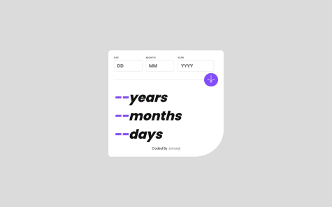
I see you are doing a very nice job, but I noticed some issues. First, when I choose the current year, I can select a month that's beyond the current month. Similarly, when I choose the current year and the current month, I can also choose a day that's beyond the current day. This can result in a negative age calculation.
For example, if today is 10/21/2023, I can choose 12/30/2023, and that will return 0 years, -2 months, -9 days.
So, I suggest creating some functions to validate the selected month and day.
Happy coding, and if you need any assistance with this, I'm ready to help you.
Marked as helpful1 - @mcasti19Submitted about 1 year ago
Hi :) this is my 5th Challenge, I think was really easy, but if you have some recomendation for me, I really appreciate it! Thanks :)
@AyoubrabiaePosted about 1 year agoHello Moises,
You are doing an excellent job. Just consider adding some border radius to the main container.
1 - @divyaprakashdpSubmitted about 1 year ago
I've just completed product-preview-card-component challenge from @frontendmentor! 🎉
Any suggestions on how I can improve are welcome!
@AyoubrabiaePosted about 1 year agoHi Divya,
I can see that you're doing a great job. However, I believe that the image's appearance on mobile devices might not be optimal. My suggestion is to add the following property to the image:
object-fit: cover;This should enhance the way the image is displayed and make it look even better on mobile screens. Keep up the good work!
0 - @its-meAshSubmitted about 1 year ago
If any problems or improvement ideas. Do share. Thank you
@AyoubrabiaePosted about 1 year agoYou're doing a great job, but I suggest adding some gap between the rating elements to prevent the bubbles from being too close together on mobile devices. Example:
gap: 10pxAlso, I noticed that when I hover over the bubbles or the submit button, their colors change very quickly. I recommend adding a transition effect to make the color changes smoother, which will enhance the overall user experience. Example:
transition: color 0.3s ease-in-out0 - @srirakeshvSubmitted about 1 year ago
All feeback are welcomed..... This one is challenging one and i take 2 days to complete this ....but, i learned a lot things in this challenge....
@AyoubrabiaePosted about 1 year agoHi, my friend,
I believe you are doing a good job, but there are a few things you could improve to make your app even better.
Firstly, consider adding transitions to elements that change when hovered or clicked, such as the links in the navigation. Currently, when we hover over them, they quickly take on an orange border. Adding transitions to these elements will make the user experience smoother and more pleasant.
Secondly, a crucial enhancement would be to allow users to change the slider image by clicking on the side images, and the floating image slider should only appear when we click on the main image.
If you need any assistance with these improvements, I'm here to help. Happy coding!
0


