Design comparison
Solution retrospective
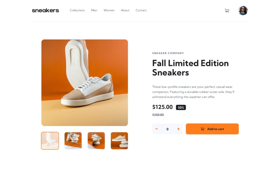
All feeback are welcomed..... This one is challenging one and i take 2 days to complete this ....but, i learned a lot things in this challenge....
Community feedback
- @AyoubrabiaePosted about 1 year ago
Hi, my friend,
I believe you are doing a good job, but there are a few things you could improve to make your app even better.
Firstly, consider adding transitions to elements that change when hovered or clicked, such as the links in the navigation. Currently, when we hover over them, they quickly take on an orange border. Adding transitions to these elements will make the user experience smoother and more pleasant.
Secondly, a crucial enhancement would be to allow users to change the slider image by clicking on the side images, and the floating image slider should only appear when we click on the main image.
If you need any assistance with these improvements, I'm here to help. Happy coding!
0@srirakeshvPosted about 1 year agoSure I use this in future works to enhance my projects ... thanks for your feedback@Ayoubrabiae
1
Please log in to post a comment
Log in with GitHubJoin our Discord community
Join thousands of Frontend Mentor community members taking the challenges, sharing resources, helping each other, and chatting about all things front-end!
Join our Discord
