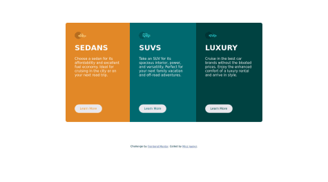
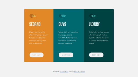
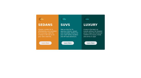
had trouble with the button hover, tried not to effect the pixel move when hovered but not sure how to. As you can see whenever u hover on the botton the bottom margin kinda moves a little.
Ax-cd
@Ax-cdAll comments
- @JaegerGBSubmitted over 2 years ago@Ax-cdPosted over 2 years ago
Hi! For the hover effect of the button, try adding a white border when the button is not on hover, that way there shouldn't be an issue with the margin shifting. And for the accessibility issue, try replacing the <div> with <footer>. Hope this helps! :)
0 - @FranPetkovicSubmitted over 2 years ago
I appreciate the feedback
@Ax-cdPosted over 2 years agoHi! Regarding the accessibility issue, just add {lang="en"} in your html tag, like so <html lang="en">. Other than that, your solution renders nicely and your code is well organized. Good work :)
Marked as helpful1 - @omenarismSubmitted over 2 years ago
This is my second practice since the last one on improving my html and css.
- I still unsure about sizing unit that can be used.
- Still don't know if using multiple headings are okay instead of one heading for long sentences.
@Ax-cdPosted over 2 years agoHi! For sizing units: prefer relative units (such as rem, em, and %) to ensure elements are responsive (like fonts or layouts), and absolute units (like px) for elements that remain fixed (like border-radius for exemple). Regarding headings: even if your title is on two lines, you should use only one h1 (or h2, etc.) and then style it with css so it is on two lines. Same goes for p tags. Your solution renders well and is similar to the given design, but you have to work on your html structure. Hope this helps!
0 - @daljeet723Submitted over 2 years ago@Ax-cdPosted over 2 years ago
Hi! You must update the images src path in your html file in order for them to appear properly. Also, instead of using <b> tag to put a text in bold, you should change the font-weight in css. And try to indent the tags in your html file so the code is easier to read. Best of luck :)
Marked as helpful0 - @muyiwa99Submitted over 2 years ago
Any tips/recommendations will be appreciated.
@Ax-cdPosted over 2 years agoHi! The only thing I noted is that the font is not the same used in the design - then I checked your code and couldn't see it either. In case it's because you don't know how to do: go to Google Fonts, select the font and the weights (indicated in the style-guide) then import the url at the top of your css file and use the font-family. Hope this helps :) Otherwise your solution is really good!
Marked as helpful0 - @ayokeedSubmitted over 2 years ago
All feedback welcome
@Ax-cdPosted over 2 years agoHi! You should try to remove the {type="text/css"} from the path of the stylesheet. Also remove unnecessary comments and lines of code (ex: l.8 and l.12); best of luck :)
0 - @k-stopczynskaSubmitted over 2 years ago
Feedback much appreciated
@Ax-cdPosted over 2 years agoHi! For the accessibility issue, you should add a link (for exemple to your Frontend Mentor profile) in the last <a> in order to resolve the problem; otherwise your solution renders well (as I see it on desktop) and your code is clean and easy to follow :)
Marked as helpful0 - @Virous77Submitted over 2 years ago
I just build it can you guys share your opinion???
@Ax-cdPosted over 2 years agoHi! Regarding the buttons: 1) You can write less code by not repeating button:hover for each button and instead making a same class, and 2) For the hover effect try to add a white border and turn the background-color to transparent (or to the color of the corresponding section); ortherwise your solution is pretty good :)
1 - @mseobSubmitted about 3 years ago
Any feedback will helpful for me. Thanks.
@Ax-cdPosted about 3 years agoHi! For the title, I would suggest using a <span> instead of separating the title in many separate <h1>. The <span> works like a <div> but for inline elements instead of blocks.
So it would be: <h1>Get <span class="highlight">insights</span> that help your business grow.</h1>
Instead of: <h1>Get </h1><h1 class="highlight">insights</h1><h1>that help</h1>
Hope it helps!
0
