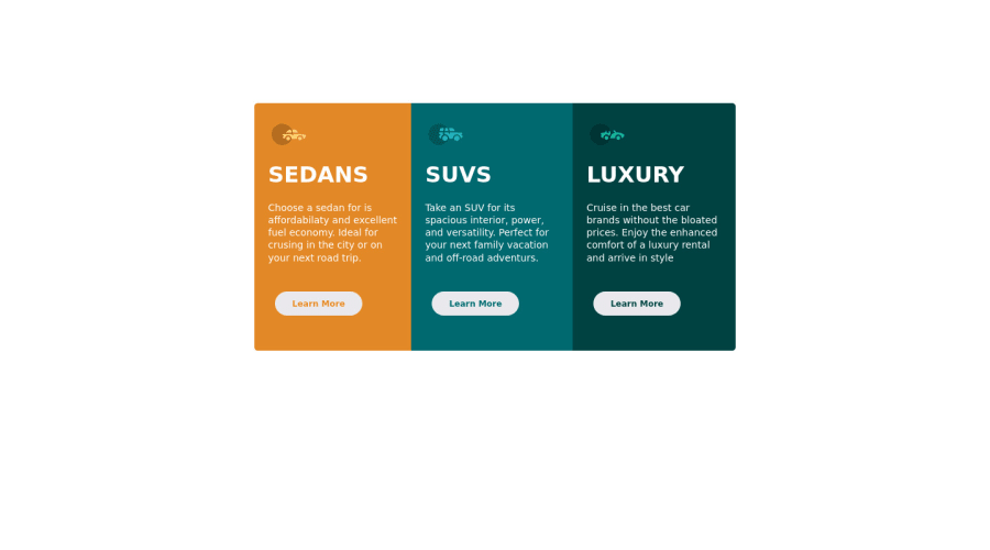
Design comparison
SolutionDesign
Solution retrospective
I just build it can you guys share your opinion???
Community feedback
- @Ax-cdPosted over 2 years ago
Hi! Regarding the buttons: 1) You can write less code by not repeating button:hover for each button and instead making a same class, and 2) For the hover effect try to add a white border and turn the background-color to transparent (or to the color of the corresponding section); ortherwise your solution is pretty good :)
1@Virous77Posted over 2 years ago@Ax-cd Thank you will keep remember for next time.
1
Please log in to post a comment
Log in with GitHubJoin our Discord community
Join thousands of Frontend Mentor community members taking the challenges, sharing resources, helping each other, and chatting about all things front-end!
Join our Discord

