

Design comparison

Solution retrospective
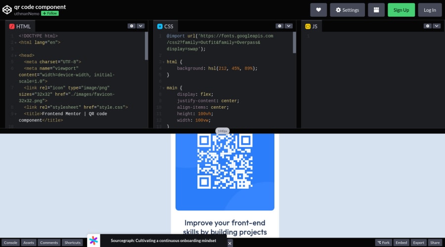
This is my second practice since the last one on improving my html and css.
- I still unsure about sizing unit that can be used.
- Still don't know if using multiple headings are okay instead of one heading for long sentences.
Community feedback
- @FahimEchoPosted almost 3 years ago
you should try VS code bro.. please dont attached codepen screenshot
1@FahimEchoPosted almost 3 years ago@omenarism dont be sorry.. its okay.. keep touch and please fix the url .. thank you
0 - @remtainePosted almost 3 years ago
Looks good! One comment I'd give though is that you don't really need to have a separate tag for each line of text. It will be okay for this project since you're trying to make it look exactly like the screenshot, but it's a hassle that you don't really need. Just make the text wrap to fit the box size. Overall though, nice job!
0 - @Ax-cdPosted almost 3 years ago
Hi! For sizing units: prefer relative units (such as rem, em, and %) to ensure elements are responsive (like fonts or layouts), and absolute units (like px) for elements that remain fixed (like border-radius for exemple). Regarding headings: even if your title is on two lines, you should use only one h1 (or h2, etc.) and then style it with css so it is on two lines. Same goes for p tags. Your solution renders well and is similar to the given design, but you have to work on your html structure. Hope this helps!
0


Please log in to post a comment
Log in with GitHubJoin our Discord community
Join thousands of Frontend Mentor community members taking the challenges, sharing resources, helping each other, and chatting about all things front-end!
Join our Discord