👋 Hi everyone! I'm Frontend enthusiast, JavaScript tamer, and aspiring clean-code wizard. Juggling code, kids, and books —because why choose just one challenge? Dreaming of a job where I debug by day and sleep by night. Until then, coffee and console logs are my best friends! 🚀
Latest solutions
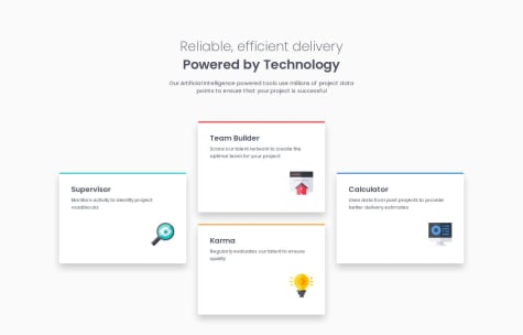
Four Card Feature Section | CSS Grid, Flexbox & Responsive Design
Submitted about 1 month agoThose colored card top borders...
Border-radiusbutchers them like bad bangs. Is there a sleek fix? Maybe::beforewithposition: absolute? Or aCSS trickI’m missing?If you’ve got a hack—I’m all ears!
Responsive Recipe Page
Submitted about 1 month agoCSS Optimization : Are there ways to further optimize or refactor my CSS for better performance or readability?
Accessibility : Are there additional accessibility improvements I could make, such as ARIA roles or better contrast ratios?
Custom Social Links Profile – HTML, CSS, Flexbox & Accessibility
Submitted about 1 month agoI’d love to learn best practices for styling parent elements based on the state of their children, especially in terms of accessibility and keyboard navigation.
Latest comments
- @masterjaneza@Asyalapa
Your project is a great example of thoughtful use of CSS Grid to create a clean and professional layout. The design works well even on smaller screens, although the transition between desktop and mobile could be a bit smoother.
A few small tweaks in styling would bring it even closer to the original design, but even as it stands now, the work leaves a very positive impression and clearly reflects your dedication. It’s truly inspiring! Keep going — you’ve got amazing potential! 🌟🔥
- @FlightReacts11What are you most proud of, and what would you do differently next time?
none
What challenges did you encounter, and how did you overcome them?none
What specific areas of your project would you like help with?none
@AsyalapaGreat work! Your
grid layoutis neat and adapts well. While the font sizes differ slightly from the mockup, your version looks modern. For mobile devices, you could make the fonts and spacing slightly more compact - this would improve readability. The use of vh units for flexible spacing is particularly well done.The most important thing - you've handled the grid adaptation excellently, which is always the most challenging part. Just a few details left to refine, but the foundation is already very solid. Good job!
- P@harshitkumarpatel28@Asyalapa
Great job on the product card! The responsiveness is implemented perfectly — using different images for mobile and desktop ensures the layout works seamlessly across all screen sizes.
The only small thing to consider is the alignment of the text and icon inside the "Add to Cart" button. They are slightly off-center vertically. This can be fixed by adding
display: flexto the button withjustify-content: centerandgapto ensure proper alignment and spacing between the elements. For example: .add-to-cart { display: flex; justify-content: center; gap: 8px; } This adjustment would make the button more visually balanced and improve the overall aesthetics of the component, in my opinion.Overall, fantastic work! It’s clear you paid close attention to detail, and the result is a sleek, functional component that fully meets the requirements. Keep up the great work! 🚀
- P@wstyprWhat are you most proud of, and what would you do differently next time?
I'm most proud of the responsiveness of the page. But I don't feel the CSS I write is efficient.
What challenges did you encounter, and how did you overcome them?I'm not familiar with the table styling. Just trial and error.
What specific areas of your project would you like help with?I'm okay for now.
@AsyalapaYou’ve done an amazing job, and the project looks professional and well-executed. It demonstrates your strong understanding of modern web development approaches, such as the use of Flexbox, CSS variables, and media queries. Small improvements in optimization and accessibility could take it to the next level. Keep up the great work — it’s truly inspiring! 🚀
Marked as helpful - @ChinweGlory@Asyalapa
The layout looks great! 🎉 The responsiveness is on point, and the code is clean and well-structured. Vertical centering is almost perfect, but if you want to refine it further, try adding
height: 100vh;to.containerand usingdisplay: flex; flex-direction: column; justify-content: center;. On desktop, the container is slightly wider than the design, but if precision matters, reducingmax-widtha bit should help. Overall, fantastic work! Keep up the great practice, and best of luck with your coding journey! 🚀🔥😊Marked as helpful - @katrennader@Asyalapa
Great job! 🎉 The main structure is solid, the buttons are well-placed, and overall, it looks neat. The choice of colors and fonts might be intentional as your personal touch, which adds uniqueness. The extra gray rectangle is likely caused by
position: absoluteondivwithouttopandbottom, which might lead to duplication on some screens. Try usingdisplay: flex; align-items: center; justify-content: center; height: 100vh;onbodyfor proper centering. Also, addingcursor: pointer;to buttons would improve interactivity.margin-top: 5%may not always work well for vertical centering—replacing it withdisplay: flex; align-items: center; justify-content: center; height: 100vh;would be a better approach. With a bit more attention to detail, this will turn out great! 🚀🔥


