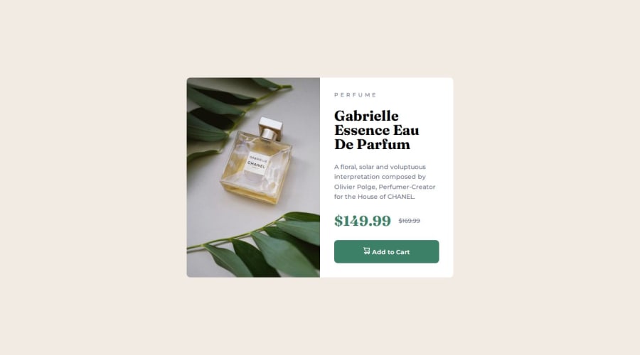
Responsive Product Preview Card using SEMANTIC HTML, CSS - Flexbox


Design comparison

Community feedback
- @AsyalapaPosted 20 days ago
Great job on the product card! The responsiveness is implemented perfectly — using different images for mobile and desktop ensures the layout works seamlessly across all screen sizes.
The only small thing to consider is the alignment of the text and icon inside the "Add to Cart" button. They are slightly off-center vertically. This can be fixed by adding
display: flexto the button withjustify-content: centerandgapto ensure proper alignment and spacing between the elements. For example: .add-to-cart { display: flex; justify-content: center; gap: 8px; } This adjustment would make the button more visually balanced and improve the overall aesthetics of the component, in my opinion.Overall, fantastic work! It’s clear you paid close attention to detail, and the result is a sleek, functional component that fully meets the requirements. Keep up the great work! 🚀
0

Please log in to post a comment
Log in with GitHub
Join our Discord community
Join thousands of Frontend Mentor community members taking the challenges, sharing resources, helping each other, and chatting about all things front-end!
Join our Discord