
Solution retrospective
Proud Of : I’m most proud of achieving a clean, responsive design using CSS variables and Flexbox, which made the code modular and easy to maintain.
Do Differently : Next time, I’d plan the image scaling and responsiveness earlier in the process to avoid rework. Additionally, I’d explore using CSS Grid for more complex layouts.
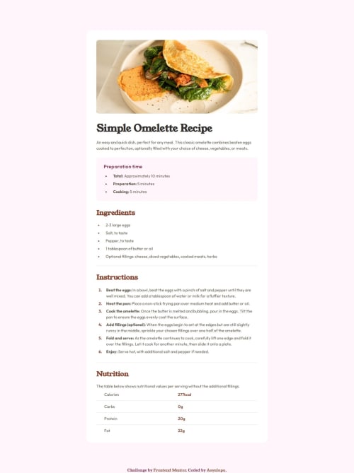
What challenges did you encounter, and how did you overcome them?Challenges : Matching colors and sizes from the design image without a Figma file was difficult, as was adapting the omelette image for mobile devices. Ensuring consistent spacing and alignment across screen sizes also required significant effort.
Overcame Them : I used browser developer tools to fine-tune dimensions. For responsiveness, I added media queries and adjusted padding, margins, and font sizes iteratively until the layout looked balanced on all devices.
What specific areas of your project would you like help with?CSS Optimization : Are there ways to further optimize or refactor my CSS for better performance or readability?
Accessibility : Are there additional accessibility improvements I could make, such as ARIA roles or better contrast ratios?
Please log in to post a comment
Log in with GitHubCommunity feedback
No feedback yet. Be the first to give feedback on Anastasia's solution.
Join our Discord community
Join thousands of Frontend Mentor community members taking the challenges, sharing resources, helping each other, and chatting about all things front-end!
Join our Discord