You are welcome!
Arboricum
@ArboricumAll comments
- @ZislinVSubmitted about 1 year ago@ArboricumPosted 12 months ago
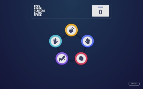
there's nothing to say more than you did a really amazing job: very nice animations, I like the click option to show the result, the draw option, and it's all perfectly responsive! Really really good
1 - @AnnaofAmberSubmitted about 1 year ago@ArboricumPosted 12 months ago
Very nice job: you also included, as I did, the draw option. Everything works fine BUT the view size under 325 width: the icons at that point are misplaced! The other thing I don't like, but it's really a matter of tastes, is that the result is suddenly shown as soon as you make your choice, maybe a little animation would be more nice.
Marked as helpful0 - @nanatotibadzeSubmitted about 1 year ago@ArboricumPosted 12 months ago
You did a very nice job: I appreciated the two modes switch at the beginning and the restart button, even if it was not in the design; same for the score increasing or decreasing in relation to the win cases. Everything is perfectly responsive at every view size. The only (very) little "mistake" is that the rule button is not centered in mobile view.
0 - @Ali-m81Submitted about 1 year ago@ArboricumPosted 12 months ago
What I like: the animation in desktop mode to show the result and the score going down if you lose. What should be improved:
- the page opens with rules opened;
- the rules window is not properly positioned;
- the header between width 600 and 810 overflows;
- at width 360 the view turns back to desktop one;
- the rules button is not centered in mobile view;
- the closing icon of the rules is on the rigth top instead of bottom center;
- the score is updated before the result is shown
0 - @LoaiEsam37Submitted about 1 year ago
Any suggestions on how I can improve and reduce unnecessary code are welcome!
Thank you. 😊✌️
@ArboricumPosted about 1 year agoI think that the datas should be stored, so when you trigger the "go back" button you still find them in place
Marked as helpful1


