Design comparison
SolutionDesign
Community feedback
- @ArboricumPosted 12 months ago
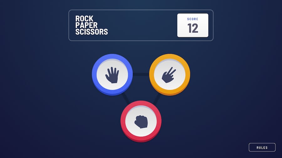
What I like: the animation in desktop mode to show the result and the score going down if you lose. What should be improved:
- the page opens with rules opened;
- the rules window is not properly positioned;
- the header between width 600 and 810 overflows;
- at width 360 the view turns back to desktop one;
- the rules button is not centered in mobile view;
- the closing icon of the rules is on the rigth top instead of bottom center;
- the score is updated before the result is shown
0@Ali-m81Posted 12 months ago@Arboricum Dear friend, hello, good time According to the original plan and according to the practice features of the project, it has been updated and the original plan has not been implemented exactly. Thank you for your opinion and I will try to improve this matter
0
Please log in to post a comment
Log in with GitHubJoin our Discord community
Join thousands of Frontend Mentor community members taking the challenges, sharing resources, helping each other, and chatting about all things front-end!
Join our Discord
