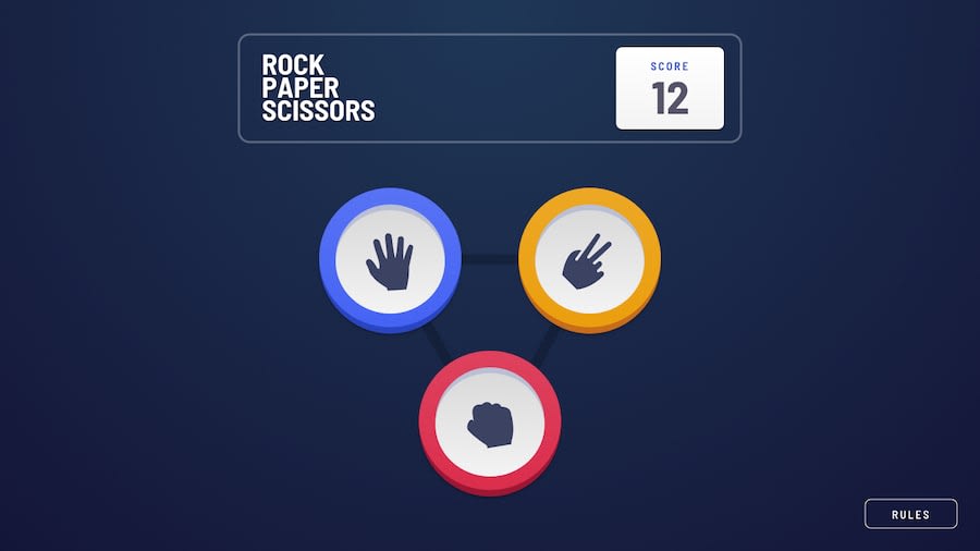
Design comparison
SolutionDesign
Community feedback
- @ArboricumPosted 12 months ago
You did a very nice job: I appreciated the two modes switch at the beginning and the restart button, even if it was not in the design; same for the score increasing or decreasing in relation to the win cases. Everything is perfectly responsive at every view size. The only (very) little "mistake" is that the rule button is not centered in mobile view.
0@nanatotibadzePosted 12 months agoThank you for your feedback @Arboricum, I appreciate it very much ^_^ .
0
Please log in to post a comment
Log in with GitHubJoin our Discord community
Join thousands of Frontend Mentor community members taking the challenges, sharing resources, helping each other, and chatting about all things front-end!
Join our Discord
