Not Found
Not Found
Not Found
Not Found
Not Found
Not Found
Not Found
Not Found
Not Found
Not Found
Not Found
Not Found
Not Found
Not Found
Not Found
Not Found
Not Found
Not Found
Not Found
Not Found

All comments

  • jmoody28 20

    @jmoody28

    Submitted

    What are you most proud of, and what would you do differently next time?

    I'm most proud of recognizing that i was writing too much javascript code when I first started and thinking of ways to cut out or simplify unnecessary code.

    What challenges did you encounter, and how did you overcome them?

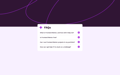
    I had trouble figuring out how to open and collapse the accordion. My first attempt was to have a function that would append and remove a element on button click but could not get it to work like I thought it would. Eventually I did some reading on MDN and figured I could make a function that would just change the display property of the text.

    What specific areas of your project would you like help with?

    I don't have anything in particular I want feedback on but any advice or criticism will be appreciated.

    @Aggressive-Mohammed

    Posted

    Your FAQ accordion code is nicely structured and readable. However, I have a few suggestions to help improve it in terms of best practices, accessibility, and maintainability:

    1. Semantic HTML Use <details> and <summary>: Instead of using buttons for your accordion, you can use the <details> and <summary> elements, which are semantic for this type of content and automatically include accessible features like keyboard navigation.
    <details> <summary>What is Frontend Mentor, and how will it help me?</summary> <p> Frontend Mentor offers realistic coding challenges to help developers improve their frontend coding skills... </p> </details> This not only makes your code more semantic but also provides out-of-the-box accessibility for screen readers.
    1. Accessibility Keyboard Accessibility: If you stick with buttons, make sure the accordion is accessible via keyboard. Adding aria-expanded attributes on the buttons can help screen readers understand whether a section is expanded or collapsed.
    <button class="drop-down" aria-expanded="false" aria-controls="faq1"> What is Frontend Mentor, and how will it help me? </button> <div class="info" id="faq1" hidden> <p>Frontend Mentor offers realistic coding challenges...</p> </div> You’ll also want to toggle the aria-expanded attribute and show/hide the content dynamically with JavaScript when a button is clicked.
    1. Improve SEO Meta Description: Consider adding a meta description for better SEO and to improve the way your page looks when shared on social media.
    <meta name="description" content="Frequently asked questions about Frontend Mentor and how it helps developers improve their frontend coding skills." />
    1. Performance Optimization Preload Critical Resources: You can optimize font loading by preloading the Google Fonts stylesheet, as font loading can sometimes block rendering.
    <link rel="preload" href="https://fonts.googleapis.com/css2?family=Work+Sans:ital,wght@0,100..900;1,100..900&display=swap" as="style">
    1. Fallback for Older Browsers If you're using newer CSS or JavaScript features, ensure you test your code on different browsers or provide fallbacks where necessary.

    Final Thoughts Overall, your structure is great, but integrating semantic elements, accessibility, and performance best practices can make your FAQ accordion component even more robust and user-friendly!

    0
  • @Aggressive-Mohammed

    Posted

    Hello Youssef Mohammadi!

    Congratulations on completing the challenge. You did awesome! Your HTML structure is well-organized and demonstrates a solid understanding of semantic elements. However, here are some recommendations and comments in terms of web development best practices:

    1. File Organization and Dependencies CSS Order: Normalize.css should be the first stylesheet since it resets default browser styles, ensuring consistent styling across browsers. Load it before any custom CSS.
    <link rel="stylesheet" href="assets/css/normalize.css" /> <link rel="stylesheet" href="assets/css/all.min.css" /> <link rel="stylesheet" href="assets/css/master.css" /> CSS Loading Strategy: If master.css is large, consider using media="all" or even lazy loading it with the media="print" trick for faster page load times, especially on slower networks.

    External Font Optimization: Consider loading fonts more efficiently using the rel="preload" strategy for better performance.

    <link rel="preload" href="https://fonts.googleapis.com/css2?family=Rubik:ital,wght@0,300..900;1,300..900&display=swap" as="style"> 2. HTML Semantics and Accessibility Form Element: Wrap the search input and button in a <form> element to improve accessibility and user experience. This will also allow users to submit the form by pressing the "Enter" key. <form onsubmit="searchIp(); return false;"> <input type="text" /> <button type="submit"> <i class="fa-solid fa-angle-right"></i> </button> </form> Labels for Inputs: Add a label to the text input for accessibility, especially for screen readers.

    <label for="ip-search">IP Address</label> <input type="text" id="ip-search" placeholder="Search for IP..." /> Descriptive Alt Text: If you plan to use icons, provide meaningful descriptions via alt attributes or consider using the aria-label attribute if the <i> tag does not support alt text.

    1. Accessibility Improvements Interactive Elements: Ensure that the button has a role="button" and focus/hover states for accessibility.

    Use appropriate landmarks like <header> for the header and <section> for different parts of your UI to improve semantic structure.

    <header class="header"> <!-- content --> </header> Heading Structure: Use headings like <h1>, <h2>, etc., to describe the content for better structure and SEO. The current structure lacks headings which might affect how the page is understood by screen readers and search engines.

    Example:

    <h1>IP Tracker</h1> 4. JavaScript Best Practices Deferred Loading: Move your JavaScript to the end of the <body> or use the defer attribute to prevent blocking the initial render of your page.
    0
  • rdxnandi 200

    @rdxnandi

    Submitted

    What are you most proud of, and what would you do differently next time?

    Nil

    What challenges did you encounter, and how did you overcome them?

    Nil

    What specific areas of your project would you like help with?

    Nil

    @Aggressive-Mohammed

    Posted

    Hello rdxnandi!

    Congratulations on completing the challenge. You did awesome!

    Your HTML structure is well-organized and demonstrates a solid understanding of semantic elements. However, here are some recommendations and comments in terms of web development best practices:

    1. Accessibility (a11y) Semantic HTML: Use more meaningful semantic tags for better accessibility and SEO. Wrap the content with appropriate tags like <main> for the main content. Consider using <section> or <article> for structured content rather than generic <div> elements. For the score, use an <h2> or another appropriate heading level instead of repeating <h3> multiple times. Example:
    <section aria-labelledby="summary-heading"> <h2 id="summary-heading">Summary</h2> </section> Alt Text: The alt text for your images can be more descriptive.

    Instead of "alt='Reaction'", you could use something like "alt='Reaction icon'" to describe the image better. Button Text: Consider adding aria-label or more descriptive text to the "Continue" button for better accessibility.

    Example: aria-label="Proceed to the next section"

    1. SEO Best Practices Meta Tags: Include meta description tags to improve SEO. This will also help your page look better when shared on social media or search engines. Example:
    <meta name="description" content="Check your test results summary and see how you compare with others." />

    Final Thoughts: Your code already adheres to good foundational practices, but integrating these suggestions will help improve the accessibility, responsiveness, and overall maintainability of the project. Keep up the good work!

    1
  • zee 90

    @zeenox-stack

    Submitted

    What challenges did you encounter, and how did you overcome them?

    the grid, i just learned it so it a little hard i somehow managed to understand it properly.

    @Aggressive-Mohammed

    Posted

    Hello zee!

    Congratulations on completing the challenge. You did awesome!

    Your HTML code structure for the "Four Card Feature Section" looks good, but there are a few enhancements you can make to improve its readability, accessibility, and maintainability:

    Recommendations: Improve Semantics:

    Use semantic tags like <section> and <article> for each card to clarify the structure of your content. Avoid using <main> multiple times within one document, as it’s meant for the main content of the page, not individual components. Replace <main class="description"> and <main class="img"> with <div> or <article> for each card section. Example:

    <article class="team"> <div class="description"> <h3>Team Builder</h3> <p>Scans our talent work to create the optimal team for your project</p> </div> <div class="img"> <img src="icon-team-builder.svg" alt="Icon for Team Builder"> </div> </article> Accessibility Enhancements:

    Ensure descriptive alt text for the images. Instead of "team png" or "karma png," use a more descriptive text like "Icon for Team Builder" or "Icon for Karma." Heading Structure:

    Maintain a proper heading hierarchy. Your headings <h1>, <h2>, and <h3> should reflect the importance of each section. It looks like you’re on the right track with that, but make sure to keep this consistent as your page grows. CSS Class Names:

    CSS class names should be consistent and use a clear naming convention. For example, instead of mixing team, Supervisor, Karma, and calculator, consider using a more uniform naming style, such as card-team, card-supervisor, card-karma, and card-calculator. Add Wrapper for the Main Section:

    Consider wrapping the four cards inside a <div> or <section> with a class to help with layout styling. Break Long Text into Multiple Lines:

    To improve code readability, break the long paragraph into multiple lines without using the <br> tag.

    These updates will make your code more readable, accessible, and well-structured for both users and developers. Happy coding!

    0
  • @Aggressive-Mohammed

    Posted

    Hello Chimi Rinzin!

    Congratulations on completing the challenge. You did awesome! Your HTML structure looks solid, and it captures the testimonials in a well-organized format. There are, however, a few small improvements you can make to enhance clarity, consistency, and accessibility:

    Recommendations: Alt Text for Images:

    Improve the alt attributes by making them more descriptive. Instead of just "Daniel's Picture," consider a more detailed description like "Portrait of Daniel Clifford, Verified Graduate." Example: <img src="./images/image-daniel.jpg" alt="Portrait of Daniel Clifford, Verified Graduate" />

    Heading Hierarchy:

    Ensure proper heading structure for accessibility and SEO. Each section has an <h1>, but for better hierarchy, consider changing subsequent headings to <h2>. The main page title should use <h1>, and the rest should be <h2> or lower. Example:

    <h2>I received a job offer mid-course, and the subjects I learned...</h2> Consistent Class Names:

    It’s best to maintain a consistent naming convention for your CSS classes. In some sections, you're using "first," "second," etc., which can be a bit unclear. Consider using more descriptive names like "testimonial-daniel," "testimonial-jonathan," and so on. Example:

    <div class="testimonial-daniel"> Font Style Link:

    The font style link for Barlow Semi Condensed is connected correctly, but you could import only the specific weights you're using to reduce page load time if you're not using all weights. Spacing and Alignment:

    Ensure that spacing (margin and padding) between elements is handled in your CSS for consistent alignment across devices. Accessibility:

    For better screen reader support, consider wrapping the entire profile and testimonial content in <article> tags, as each testimonial represents a self-contained piece of content. Example:

    <article> <div class="profile"> <img src="./images/image-daniel.jpg" alt="Portrait of Daniel Clifford, Verified Graduate" /> <div class="names"> <p class="name">Daniel Clifford</p> <p class="verified">Verified Graduate</p> </div> </div> <h2>I received a job offer mid-course...</h2> <p class="quotes">“ I was an EMT for many years before I joined the bootcamp...”</p> </article> Challenge Name in Title:

    The <title> tag currently has a placeholder [Challenge Name Here]. It would be good to replace that with the actual challenge name, such as "Frontend Mentor | Testimonial Grid Challenge."

    Implementing this improves clarity, accessibility, and organization, which will enhance user experience and maintainability.
    Marked as helpful

    0
  • @Aggressive-Mohammed

    Posted

    ¡Hola MindCode-89!

    ¡Felicitaciones por completar el desafío! ¡Hiciste un trabajo increíble! Tu estructura HTML está bien organizada y demuestra un sólido entendimiento de los elementos semánticos. Sin embargo, aquí tienes algunas recomendaciones y comentarios en cuanto a las mejores prácticas de desarrollo web:

    Recomendaciones: Fuera de <ul> o <ol>: Has utilizado elementos <li> sin envolverlos dentro de una lista desordenada <ul> o una lista ordenada <ol>. Para mejorar la semántica HTML, todos los elementos de lista <li> deben estar dentro de listas desordenadas <ul> o listas ordenadas <ol>. Ejemplo:

    <ul> <li><strong>Total:</strong> Aproximadamente 10 minutos</li> <li><strong>Preparación:</strong> 5 minutos</li> <li><strong>Cocción:</strong> 5 minutos</li> </ul> Sección de Nutrición: El valor de "Grasa" debe usar una unidad adecuada (g para gramos) en lugar de cal, y debe coincidir con el formato de las otras entradas. Parece que debería ser "22g" en lugar de "22cal." Ejemplo: <tr> <th>Grasa</th> <td><strong>22g</strong></td> </tr> Atributo Alt para Imágenes: El texto alternativo de tu imagen debería describir mejor el contenido. En lugar de "omelete-logo", un texto alternativo más descriptivo como "Imagen de una tortilla simple" sería mejor para la accesibilidad. Ejemplo:

    <img src="images/image-omelette.jpeg" alt="Imagen de una tortilla simple" width="600px" height="300px" /> Errores Tipográficos: Corrige los errores tipográficos como: "Saltto taste" → "Sal al gusto." "Nutrution" → "Nutrición." "Beat the eggs" está repetido en las instrucciones. Elimina la oración redundante.

    HTML Semántico: Envuelve las listas y secciones en etiquetas semánticas adecuadas para mayor claridad y accesibilidad. También puedes considerar usar <article> para las secciones de recetas y envolver los ingredientes e instrucciones en <section> para separarlos lógicamente.

    Espaciado Consistente: Asegúrate de mantener un espaciado consistente entre los elementos HTML y evita frases continuas o la falta de espacios, como "strong>Enjoy:</strong>Serve hot" debería ser "strong>Enjoy:</strong> Serve hot."

    Estas actualizaciones harán que tu código sea más legible, accesible y bien estructurado tanto para los usuarios como para los desarrolladores.

    0
  • Rodri 100

    @rcsilva211

    Submitted

    What are you most proud of, and what would you do differently next time?

    I'm happy that I was able to consolidate flexblox concepts even more, but near the end, realized it would be a better approach to use a grid (thanks to the fellows on discord). I'm happy that, despite having taken some time, I was able to make a good job!

    What challenges did you encounter, and how did you overcome them?

    Definitely learning the css grid. A lot of properties to learn and understand, but very convenient! Will be focusing on using and learning grid a lot more.

    What specific areas of your project would you like help with?

    If possible, check if my css is well structured and understandable.

    @Aggressive-Mohammed

    Posted

    Hello Rodri! Your HTML code for the "Four card feature section" is well-structured and follows good practices. Below are some comments and recommendations for improvement:

    1. Accessibility: Image Alt Text: The alt attributes for the images are currently empty (alt=""). Even though these icons may be decorative, it's best to provide more meaningful alt text, or if they are purely decorative, use role="presentation" to explicitly state that they’re decorative. Example:
    <img src="./images/icon-supervisor.svg" alt="Supervisor Icon" /> or <img src="./images/icon-supervisor.svg" alt="" role="presentation" />
    1. Heading Hierarchy: The current heading structure jumps from an <h1> to an <h2>, which is fine, but make sure the hierarchy remains logical across all content. The cards use <h3>, which is appropriate as a subsection of the main content. Consider making the section title more descriptive, like wrapping it in a <section> tag with an accessible label.

    2. Semantic HTML: The structure is clear, but you could enhance semantics by using a <section> or <article> tag for the cards, which improves both SEO and accessibility. For example:

    <section class="card supervisor"> <h3>Supervisor</h3> <p>Monitors activity to identify project roadblocks</p> <img src="./images/icon-supervisor.svg" alt="Supervisor Icon" /> </section> 4. CSS Reset: Make sure that your cssreset.css file contains appropriate reset rules to standardize the appearance across browsers. You might also want to consider using a modern reset like Normalize.css.
    1. External Links: The footer includes a link to Frontend Mentor, which opens in a new tab (target="_blank"). It’s best practice to include rel="noopener noreferrer" for security reasons, especially with external links:

    <a href="https://www.frontendmentor.io?ref=challenge" target="_blank" rel="noopener noreferrer">Frontend Mentor</a> 6. Class Naming: Your class names are clear and specific, but using a consistent naming convention such as BEM (Block Element Modifier) could make your CSS more maintainable. For example:

    <div class="card card--supervisor">
    1. HTML Validation: Always run your HTML through a validator (like the W3C Validator) to check for any structural issues or missing elements.
    2. Alt Text for Footer Attribution: The footer includes an attribution section where the author name "Digo" is linked, but the href is empty. You should replace it with a valid URL or remove the link if it's not needed.
    3. Performance Optimization: Preloading fonts or important resources might help with performance, though this depends on the size of the project. You’re already using a reset stylesheet, which is a good performance practice. I hope this will be something usefull to you.
    0
  • @Aggressive-Mohammed

    Posted

    Hello Onyedikachi Miracle Nnaji!

    Congratulations on completing the challenge. You did awesome! Your HTML structure is well-organized and demonstrates a solid understanding of semantic elements. However, here are some recommendations and comments in terms of web development best practices: Semantic HTML:

    Consider using more semantic elements, such as <article> for the main recipe content and <section> for different sections (like ingredients, instructions, etc.). This improves accessibility and readability. Image Alt Text:

    The alt attribute for the image is currently set to "pic." Providing a more descriptive alt text (e.g., alt="Simple Omelette" or alt="Omelette with various fillings") would enhance accessibility for screen readers. Headings Hierarchy:

    Ensure that your headings follow a logical hierarchy. For example, use <h2> for "Ingredients" and "Instructions" instead of <h1>, as they are subsections of the main title. Nutrition Information:

    You might consider using a table for presenting the nutrition information, which is more structured and easier to read. For example: html Copy code

    <table> <tr> <th>Nutrient</th> <th>Value</th> </tr> <tr> <td>Calories</td> <td>277kcal</td> </tr> ... </table> Consistent Class Naming:

    Ensure that class names are consistently applied and follow a naming convention. For example, you have list and second-list—consider whether these could be unified under a more descriptive name. Responsive Design:

    Ensure that your CSS files (styles.css and responsive.css) are optimized for responsiveness. Check that the layout works well on different screen sizes. Multiple Font Preconnects:

    You have multiple <link rel="preconnect"> tags for the same URLs. You only need one for each unique origin, so you can remove duplicates. Styling Enhancements:

    If your styles.css or responsive.css handles button styles or interactive elements, ensure that they are styled for better user interaction (hover effects, etc.). Unclosed Tags:

    There’s a stray period (.) at the end of your last <link> tag. Ensure that it’s removed to avoid HTML errors. HTML Validation:

    Run your HTML through a validator like the W3C Validator to catch any potential issues or improvements. Overall, your code is quite good, and these suggestions can help improve accessibility, structure, and readability!

    Marked as helpful

    0
  • P
    Erics 10

    @EricS02

    Submitted

    What are you most proud of, and what would you do differently next time?

    I am proud of finishing this project. I would like to have been able to finish the project in less time and with more ease, I had struggled on many areas of the project including getting the format correct and the responsiveness.

    What challenges did you encounter, and how did you overcome them?

    I struggled with using different css logic, not understanding all the formats and the differences such as padding vs margin, as well as which div I should add the css styling too to get the correct format. In the end I overcame the issues by bashing my head on the keyboard and eventually getting the correct format.

    What specific areas of your project would you like help with?

    I would like to find ways that I can more efficiently style the html and css. What ways in this challenge could you quickly format the Html and css and how each works in conjuction with each other.

    @Aggressive-Mohammed

    Posted

    Hello Erics!

    Congratulations on completing this challenge. You did awesome! Your HTML code for the product preview card component looks solid! Here are some comments and recommendations to enhance it further:

    Semantic HTML:

    Use more semantic tags for better structure and accessibility. For example, consider using <article> for the card content and <header> for the title and description. Image Alt Text:

    The alt attribute for the image is empty. Providing descriptive alt text (e.g., alt="Gabrielle Essence Eau De Parfum product image") improves accessibility for screen readers and SEO. Accessibility:

    Ensure your button is keyboard accessible. Adding aria-label to the button could provide additional context, especially if the icon alone isn’t clear. Headings Hierarchy:

    Ensure that your headings follow a logical order. If <h3> is used before <h1>, it may confuse screen readers. Consider using <h1> for the main title and <h2> for subheadings. Ensure that your images are optimized for web use (e.g., using formats like WebP) to improve loading speed. Consistent Use of Class Names:

    Ensure that class names are consistent in styling. For example, if you have a class like main-text, consider whether you need additional specificity or if it could be generalized. HTML Validation:

    Validate your HTML through a tool like the W3C Validator to catch any potential issues or best practices you might have missed. Overall, your code is well-structured and functional. Incorporating these suggestions can improve accessibility, performance, and maintainability!

    0
  • @javierdesant

    Submitted

    What are you most proud of, and what would you do differently next time?

    I happy with the overall final design. However, I’m considering using some Headless UI components next time to streamline the styling and make it more flexible. That said, just finishing this project feels like a major accomplishment on its own, and I’m happy with how it turned out!

    What challenges did you encounter, and how did you overcome them?

    Managing the state of the multistep form was a challenge, but I was able to address it by implementing a form provider. I also made the decision to replace the phone input with an imported component, as I wasn’t sure how to properly handle validation using Zod without it... what do you think?

    What specific areas of your project would you like help with?

    I had some trouble implementing the footer navigation bar for mobile screens, and it still isn’t working as expected. If anyone has tips or advice on this issue (or any other part of my code, really) feel free to comment and share your feedback!

    @Aggressive-Mohammed

    Posted

    Hello Javier de Santiago!

    Congratulations on completing the challenge. You did awesome! You nearly got a pixel-perfect solution. Your HTML structure is well-organized and demonstrates a solid understanding of semantic elements. However, here is a recommendation and comments in terms of web development best practices: Meta Tags: Add a <meta name="description" content="Description of the multi-step form"> tag to improve SEO. A clear description helps with search visibility.

    Overall, your code is well-structured for a React-based application. Incorporating this suggestion can help enhance accessibility. Great job!

    0
  • @Aggressive-Mohammed

    Posted

    Hello marianocejasdev!

    Congratulations on completing the challenge. You did awesome!. Infact, you nearly got a pixel-perfect solution. Your HTML structure is well-organized and demonstrates a solid understanding of semantic elements. However, here are some recommendations and comments in terms of web development best practices: Semantic HTML: Consider using more semantic elements where appropriate. For example, use <header>, <section>, or <article> to better structure your content. For instance, the main content inside <main> could be wrapped in a <section> or <article>. Accessibility:

    Add aria-labels or other ARIA attributes where necessary to improve accessibility. For instance, the alt text for the image should be descriptive of the image’s content, which you’ve done well here. Consider adding a role="navigation" to the list of social links to indicate that it's a navigation menu. SEO Optimization:

    Ensure that the title tag and meta description are optimized for SEO. Although the title and description are relevant, making them more descriptive and including keywords could improve SEO. External Resources: Links: The href="#" in the social links does not lead anywhere. Consider either adding actual URLs or using a placeholder like # only for testing. HTML Validation: Overall, your code looks well-structured. Incorporating these best practices can help improve accessibility, SEO, and performance.

    0
  • Beth Melo 10

    @Bethzila

    Submitted

    What are you most proud of, and what would you do differently next time?

    Me orgulho de ter concluído o desafio e da próxima vez tentaria fazer o desafio usando o Grid Layout.

    What challenges did you encounter, and how did you overcome them?

    Enfrentei a utilização do flexbox, procurei vídeos e exemplos para concluir o desafio.

    What specific areas of your project would you like help with?

    Gostaria de ajuda com responsividade. Abrir o site em dispositivos diferentes e que ele ficasse da mesma maneira.

    @Aggressive-Mohammed

    Posted

    Hello Beth Melo!

    Congratulations on completing the challenge. You did awesome! Your HTML structure is well-organized and demonstrates a solid understanding of semantic elements. However, here are some recommendations and comments in terms of web development best practices:

    1. Accessibility: Alt text for images: The alt attribute for the QR code image could be more descriptive. It currently just says “qr code,” but it would be more helpful to describe what scanning the code will do. Consider:
    <img src="images/image-qr-code.png" alt="QR code linking to Frontend Mentor website">

    Use of headings: The <h1> is appropriately used, but you could consider adding a <p> tag instead of a <span> for the description. This will make the text more semantically correct as a paragraph, which is generally more appropriate for larger blocks of text.

    <p class="descricao">Scan the QR code to visit Frontend Mentor and take your coding skills to the next level.</p>
    1. SEO Optimization: Meta description: Add a meta description for better SEO:
    <meta name="description" content="Improve your front-end skills by building projects. Scan the QR code to visit Frontend Mentor and level up your coding skills."> Title optimization: The title could be more descriptive to improve search engine discoverability: <title>QR Code Component - Frontend Mentor Project</title>
    1. CSS Organization: Duplicate font preconnect links: You have repeated preconnect links for Google Fonts. You only need them once, consider removing the duplicates:
    <link rel="preconnect" href="https://fonts.googleapis.com"> <link rel="preconnect" href="https://fonts.gstatic.com" crossorigin>

    CSS Optimization: You have two separate font links for different weights of the same font (Outfit). You can combine them into a single request to improve performance:

    <link href="https://fonts.googleapis.com/css2?family=Outfit:wght@400;700&display=swap" rel="stylesheet">
    1. Semantic HTML: Main content structure: You have structured the content well inside a <main> tag. Ensure the layout is semantically correct: Use <section> for grouping related content, like your QR code and description. Add a container <div> or <section> around the QR code and the text to make it more organized:
    <section class="qr-container"> <img src="images/image-qr-code.png" alt="QR code linking to Frontend Mentor website"> <h1>Improve your front-end skills by building projects</h1> <p class="descricao">Scan the QR code to visit Frontend Mentor and take your coding skills to the next level.</p> </section>
    1. Performance: Image optimization: Ensure that the image of the QR code is optimized for web use. You could further compress it or use a more modern image format like WebP for faster loading times. Lazy loading images: Add the loading="lazy" attribute to the QR code image to improve page performance:
    <img src="images/image-qr-code.png" alt="QR code linking to Frontend Mentor website" loading="lazy"> 6. Footer Links: Security for external links: Since the links in the footer open in a new tab (target="_blank"), include rel="noopener noreferrer" for security:

    Challenge by <a href="https://www.frontendmentor.io?ref=challenge" target="_blank" rel="noopener noreferrer">Frontend Mentor</a>. Fixing the author link: Currently, the "Coded by" link has no href. You should add a valid link to your GitHub or portfolio, or make it clearer if it’s a placeholder:

    Coded by <a href="https://github.com/Bethzila" target="_blank" rel="noopener noreferrer">Bethzila</a>. 7. General Cleanup: Whitespace and indentation: Your HTML code is well-indented, making it easy to read. Ensure this practice continues as your project scales.

    1. Considerations for Maintainability: If you plan on adding more components to this project, consider organizing the CSS into modules or adopting a naming convention like BEM (Block Element Modifier) to make class names more descriptive and reusable across your project. By addressing these points, your QR Code Component will be more accessible, performant, and maintainable.
    0