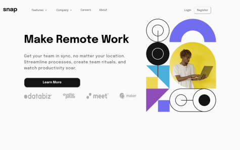
I struggled a lot while building the nav,specifically the dropdown menu, i had to use position absolute to fix it, otherwise the whole header would expand alongside the menu. I am still not sure whether using an absolute position is the best way to fix it.
In the original requirements screenshot, the menu is slightly left positioned, I think I would have to use relative positioning to do that, but that breaks the whole header, is there a better way to do it ?
Is there a way to stop the background from scrolling while the nav is open on a mobile device, I tried using touch-action:none but it didnt work.
Also, I would appreciate it if any accesibility issues could be highlighted, I tried to fix as many as I could, also used aria-expanded.


