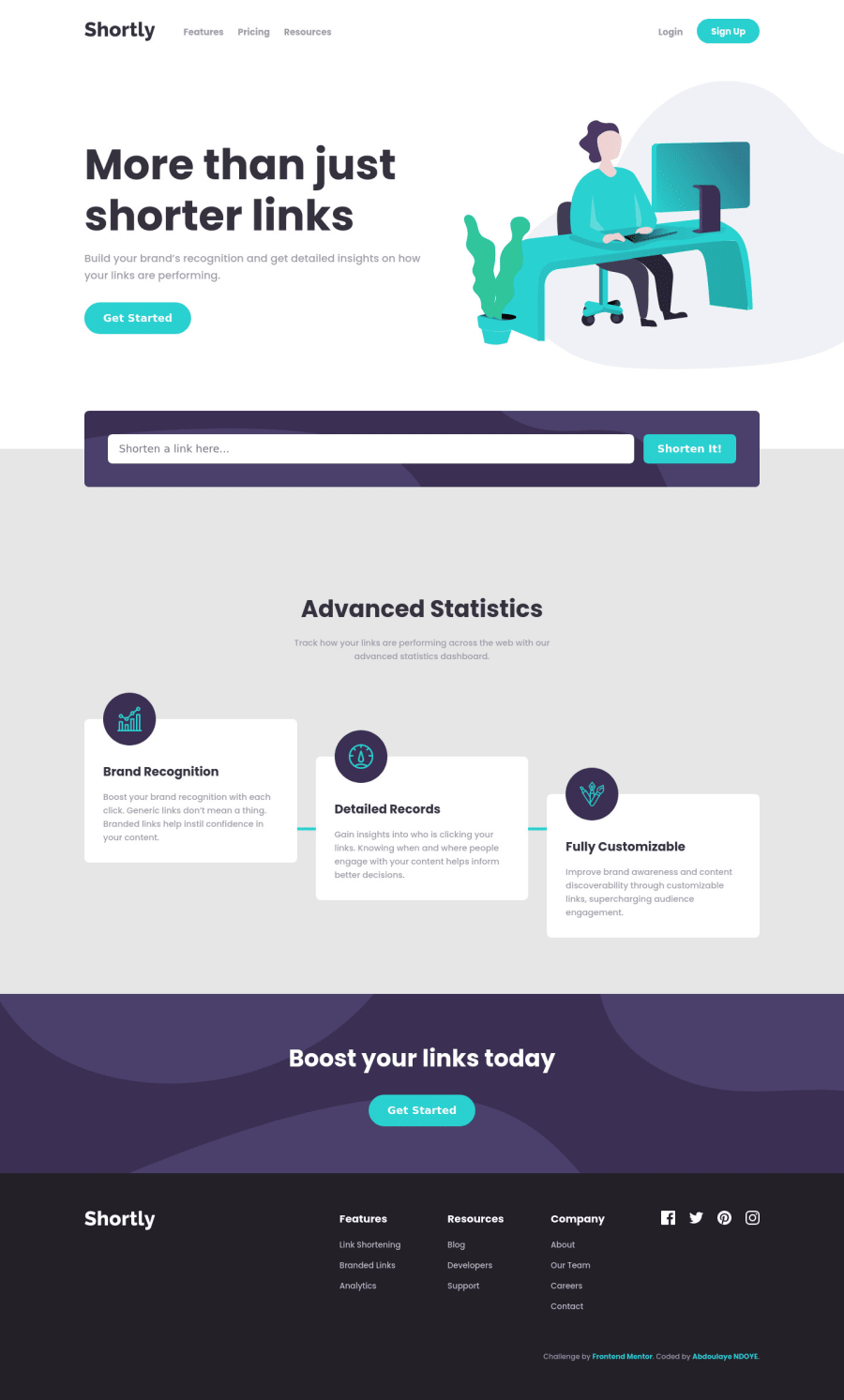
Web Ninja 101 | URL shorten App w/ ES6 JS and Sass (and some BEM)
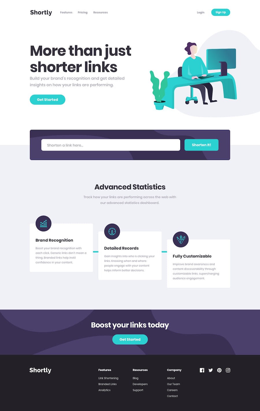
Design comparison
Solution retrospective
Hi, everyone! I learned a lot with this challenge by using some web API like MutationObserver and modularize my javascript. If you have any feedback (specially on my BEM naming convention or on how to help me minimize my CSS), feel free to let me know.
Community feedback
- @ApplePieGiraffePosted over 4 years ago
Hey, Papa Elhadj Abdoulaye NDOYE! 👋
Always nice to see you complete another challenge! I think you've done a great job on this one! 👏
Everything looks good and responds very nicely! 👍
The only tiny thing I might mention is to turn the mobile navigation icon into and close icon when the mobile navigation is opened for a slightly more intuitive UX. 😉
Keep coding, of course (and happy coding, too)! 😁
1@NDOY3M4NPosted over 4 years ago@ApplePieGiraffe Thanks for the kind words and the feedbacks, I'll try adding some animations to the button.
0 - @NDOY3M4NPosted over 4 years ago
Oups, you're right. I totally forgot to change the hover styles on mobile. Thanks for the feedback
1 - @emestabilloPosted over 4 years ago
Hey @NDOY3M4N, project looks good, congrats! Only observed two things:
-
I think the header text could wait to increase its font size until it's ready to occupy 3 lines, past 900px or so. This way, it looks more proportional to the image.
-
The links on the mobile navbar blends with the color of the background when you hover on them.
Hope this helps :-)
1 -
Please log in to post a comment
Log in with GitHubJoin our Discord community
Join thousands of Frontend Mentor community members taking the challenges, sharing resources, helping each other, and chatting about all things front-end!
Join our Discord
