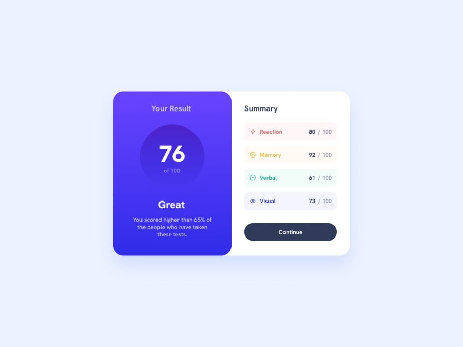
Design comparison
Community feedback
- @hitmorecodePosted over 1 year ago
Congratulations good effort. There are some issues with you page. I'm just going to address a view op them, see if you can fix it.
- Don't use % to define
border-radius, doing this will create a deformation on the radius. Use px instead. - Why do you have three media queries? You can easily do this challenge with just one media query.
- When the screen size goes under 1440px, the content on the page stretches to fill the width of the page. This doesn't look good.
My suggestion is remove all media queries and apply only one media query and start from there. It's best practice to start with mobile first and switch to desktop.
Marked as helpful1P@PRINCEKK122Posted over 1 year ago@hitmorecode Thank you very much for taking your valuable time to review my code. I appreciate it.
I took note of your comments, and I have made the necessary changes, I do believe that I have addressed all the issues that you saw I fell short.
Thank you very much once again, I look forward to your feedback as I will be taking more of the challenges.
0 - Don't use % to define
Please log in to post a comment
Log in with GitHubJoin our Discord community
Join thousands of Frontend Mentor community members taking the challenges, sharing resources, helping each other, and chatting about all things front-end!
Join our Discord
