Product Preview Card (Vanilla CSS and Custom Hover State on Hero)
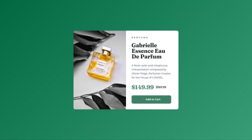
Design comparison
Solution retrospective
👾 Hello, Frontend Mentor coding community. This is my solution for the challenge Product Preview Card.
🎨This is an old old old solution and the first one that I've applied some customization. I did some improvement in the code but there are many things to improve, but I was just lazy to change the html structure to use the proper tags like the picture
for the image, because I was afraid to have to write again the grayscale effect on it. 🤭
- 👨🔬 Custom Images + Grayscale/Saturation Hover Effect
- 🧚♀️ Intro Zoom Out Animation (I need to study it more to make smooth transitions).
- 🎨 Gradient
Feel free to leave any feedback about my design chances and help me improve my solution or make the code clean!
Community feedback
- @GrzywNPosted about 2 years ago
Great job, everything looks good!
The only thing I would suggest is not to prioritize UI over UX. Because of transforms to the right it might be harder to select the product name if someone wants to copy it to look for the same product on other pages. Also, there is a point on the left side of the button where the button escapes the user. I did the same thing not too long ago, but now if I want to use some active state using the transform property, I just scale the button up a bit instead of moving it.
Have a great day and continue to inspire people!
Marked as helpful7@correlucasPosted about 2 years ago@GrzywN Hello Karol! I agree with you, wasn't thinking about that when I've applied the hover. I already fixed it removing these hover effects. This is something I'll ever take in considerations for my next projects
Thank you!
2 - @GalinaM-GPosted about 2 years ago
@Lucas Hello, Lucas,
I am not a designer at all but I can appreciate beautiful things (sometimes I practise calligraphy). I just leave my WOW here. :)
x
PS. Sorry, I can´t still be useful in coding, but maybe one day I will be.
Marked as helpful2@correlucasPosted about 2 years ago@GalinaM-G Oh this I nice! I practice lettering and caligraphy too, even if I'm not too good, the style I like most is the spencerian penmanship/business writting. Thank you for the kind words Galina =)
0@GalinaM-GPosted about 2 years ago@correlucas I am in love with Spencerian and Copperplate;). I am sure you are good at calligraphy;).
0 - @HinaSejaru124Posted about 2 years ago
You're a front-end god, but you forgot to strikethrough the other price
Marked as helpful1@correlucasPosted about 2 years ago@HinaSejaru124 Its true. Soon I'll fix it. Thanks.
0 - @AdrianoEscarabotePosted about 2 years ago
Fala mano, tudo bem?
Gostei muito de resultado do seu projeto, ficou insano o design.
Mano ta acontecendo um bug no seu layout, até troquei de navegador para ver se era algo comigo, mas não é ahauhauh vou te mostar o que está acontecendo:
Observei que você colocou
grid-template-columns: repeat(2, 1fr);
na tagmain
, porem a tag main tem apenas um div filha e está deixando uma coluna vazia, para arrumar isso eu fiz o seguinte:Retirei estes códigos:
.container { /* display: grid; */ /* grid-template-columns: repeat(2, 1fr); */ }
Adicionei os mesmos que retirei, mas em outra div:
.photo-overflow { grid-template-columns: repeat(2, 1fr); display: grid; }
Para ajustar a responsividade:
@media (max-width: 43.75rem) { .container { /* display: grid; grid-template-columns: repeat(1, 1fr); */ } .photo-overflow { grid-template-columns: repeat(1, 1fr); display: grid; } }
O resto está ótimo! Espero que ajude... 👍
Marked as helpful1@correlucasPosted about 2 years ago@AdrianoEscarabote Valeu! Na real nem sei o que fiz de errado lá, peguei um commit antes desse e resetei hahaha fiquei com preguiça de procurar o problema. Valeu mesmo, nem tinha visto que o layout tava quebrado!
0@AdrianoEscarabotePosted about 2 years ago@correlucas ahahaha de boa man, mandei uma foto no insta
1 - @zwehtetpaing098Posted about 2 years ago
How do you know precisely the width, height, and position?
1 - @dadi-frontEndPosted about 2 years ago
hello lucas it is a professionnel work best continuation
1 - @AbraCadabstraxPosted almost 2 years ago
Perhaps a bit trivial, but I would swap out the shopping cart emoji for the one provided with the assets for the project.
Otherwise very good job.
0 - @jantomaPosted about 2 years ago
very awesome friend, really greet job and professional work
0
Please log in to post a comment
Log in with GitHubJoin our Discord community
Join thousands of Frontend Mentor community members taking the challenges, sharing resources, helping each other, and chatting about all things front-end!
Join our Discord