Pomodoro Timer | React | Redux | Styled Components | Sound Effects
Design comparison
Solution retrospective
Hey FM community! I don't have any specific questions but I'd love any/all feedback on this solution. I've only been learning React the last few months so any feedback on anything related to React, Redux, or Styled Components would be much appreciated.
I wasn't able to figure out how to style the arrows that the user clicks to increase or decrease the value in the inputs of type="number" in a way that it would work on all browsers so I just scrapped styling the arrows but I think that's something I can live with.
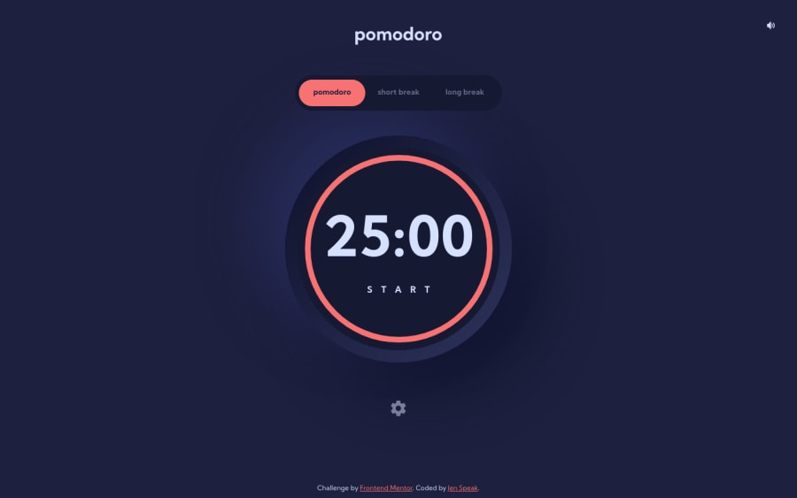
If you're curious to read more about this project, feel free to read the detailed README. Just to summarize, this project includes sound effects, Redux Toolkit for state management, and a few little animations 😊
Community feedback
- @astroudPosted over 3 years ago
Nice job Jen. There are so many ways to solve this project. I'll be looking over your code to see how you used Redux. I think it would have solved me a lot of trouble with my solution.
I don't recall how I styled the input arrows, but I do remember them giving me a lot of trouble. I just checked them again in Chrome/Firefox/Safari and there's still some room for improvement.
For my sound effects, I used Garageband and Audio Hijack to record the sfx I was considering. It's tricky finding the right notes/instruments but the audio quality is excellent.
2@En-JenPosted over 3 years ago@astroud Hope it can be helpful for you on the Redux side of things! Just know that this is my first project where I used Redux so I'm certainly not a Redux expert yet.
Thanks for the tip on using Garageband and Audio Hijak to record your own sound effects! I hadn't considered that but that might be nicer than having to dig through a bunch of existing sounds and clean the audio up. Next time I use sound on a project I'll try that out.
1 - P@tedikoPosted over 3 years ago
Hello, Jen! 👋
Congrats on finishing another challenge! I feel like you thought about everything in this project. I really like the animations, modal settings, sounds effects.. Great job! I found that arrows in number inputs aren't clickable. It is a little contrary to user intuition.
Good luck with that, have fun coding! 💪
1 - @ApplePieGiraffePosted over 3 years ago
Hey, En-Jen! 👋
Oh my goodness—your solution is amazing! 🤩 The animations and sound effects that you added fit the feel of the app perfectly! 👏 Everything works really well and you've definitely got my bookmark on this one! 😀
The only very minor thing that I noticed is that the number in the timer gets rather close to the edges of the circle at certain screen sizes—you might want to bump down the font-size just a bit, then. 😉
Keep coding (and happy coding, too)! 😁
1@En-JenPosted over 3 years ago@ApplePieGiraffe Thanks so much, I really appreciate your kind words! 🤩 Good catch on the number in the timer getting too close to the edge of the timer. Just tweaked that font size a bit so it fits better 😊 Happy coding to you too!!
1
Please log in to post a comment
Log in with GitHubJoin our Discord community
Join thousands of Frontend Mentor community members taking the challenges, sharing resources, helping each other, and chatting about all things front-end!
Join our Discord
