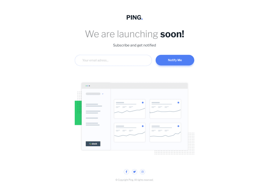
Mobile-first workflow with CSS Flexbox and Grid
Design comparison
Solution retrospective
Hi everyone,
I would appreciate any suggestion or feedback.
Thanks.
Community feedback
- @al3xbackPosted over 3 years ago
Hi Achref,
It would be good if we can move social and copyright to footer instead of section.
Marked as helpful1@AchrefFastPosted over 3 years ago@al3xback
Hey Alex,
Good point , I'll make sure to fix that.
Thank you again, I appreciate your help.
0 - @skyv26Posted over 3 years ago
Hi! Achref, very well done, your design is responsive and you implement email validation as per requirement. Only one thing I would suggest, make your social network icon little bit bigger and please correct the shape for icon, I mean not in correct circular shape.
Overall Really Nice.
Good Luck
Marked as helpful1@AchrefFastPosted over 3 years ago@skyv26
Hi Askash,
Thanks for the feedback, I appreciate that.
Regarding the Circular shape of the icons, I'm using Firefox as browser and they look circular as they should be (same result with Chrome). I used
width: 28pxandheight: 28pxwithborder-radius: 50%. I'm not sure what is the reason that makes them look out of shape.Any suggestion will be appreciated.
Thanks again.
0
Please log in to post a comment
Log in with GitHubJoin our Discord community
Join thousands of Frontend Mentor community members taking the challenges, sharing resources, helping each other, and chatting about all things front-end!
Join our Discord
