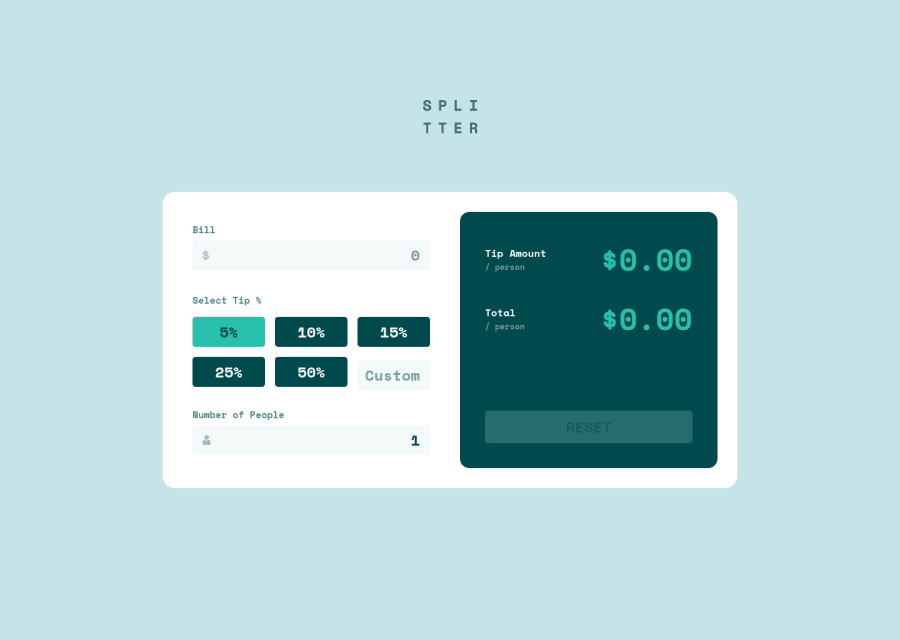
Mobile-first workflow using javascript and Sass with CSS Grid, Flexbox
Design comparison
Solution retrospective
Hi everyone,
Any suggestion, advice or feedback would be a big help.
Thanks.
Community feedback
- @UDsGitHubPosted over 3 years ago
Hey man I really love your solution, and I have been spending the past few hours trying to study and learn from it. I am still hung up on how you made the number input appear without the increment, decrement stuff... I saw your code and it looks like you used appearance, but testing stuff out on codepen, it doesnt seem to work the same for me. Any advice?
0@AchrefFastPosted over 3 years ago@UDsGitHub
Hi Udochukwu,
Thank you for your kind words.
I think the reason why it didn't work on codepen is a cross browser compatibility issue. You need to use both Firefox and Chrome style prefixes. [Check this:] (https://www.w3schools.com/howto/howto_css_hide_arrow_number.asp).
Hope this helps 🙂.
0@UDsGitHubPosted over 3 years ago@AchrefFast Hey man, Im back again. I finally came back to finish this challenge, and I am learning a lot from your solution. The current issue I am trying to figure out is, how does your onclick event work on your input element for the tips when the input elements are on appearance none. it doesnt make sense to me, and i tried to replicate what you did, even though I am working in react, but its not working. I changed my markup to look exactyl like yours with the label nesting the input and the span, and my input having the appearance of none, but it still doesnt register an onclick like yours. I understand the motive behind using the radio buttons and hiding them, thats why I want to make this work, but damn, I just cant get it to work. Any advice? Also let me know if I need to drop a snippet of my code or a codepen link to the component file where all this madness is happening. ✌👍
0@UDsGitHubPosted over 3 years ago@UDsGitHub dont mind this question... i realized my issue was that I was using the wrong value for the "for" of my labels. I also then remembered and kind of realized why you chose to use the label to wrap the inputs, and thats because for radio buttons, clicking the labels also triggers an click event for the buttons themselves
1@AchrefFastPosted over 3 years ago@UDsGitHub
Hi Udochukwu,
I'm glad to hear that you have solved the issue. Concerning the
appearance: none;that you have mentioned before, It actually doesn't affect the display of the element but only the style. it just remove the platform-specific styling to an element that does have it by default (check this: https://css-tricks.com/almanac/properties/a/appearance/ ). Hope this helps.Thanks man, I'm really happy you found my solution helpful.
Cheers.
0
Please log in to post a comment
Log in with GitHubJoin our Discord community
Join thousands of Frontend Mentor community members taking the challenges, sharing resources, helping each other, and chatting about all things front-end!
Join our Discord
