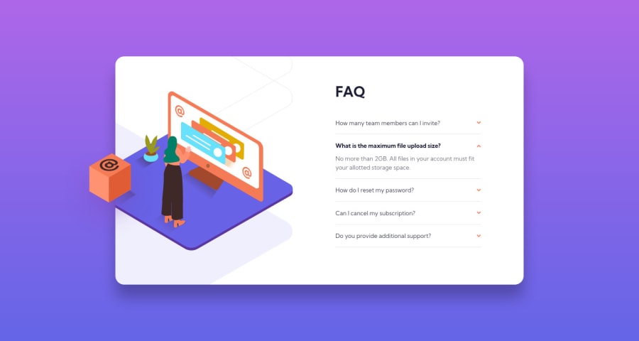
Mobile First Workflow FAQ According Card Solution with CSS Grid
Design comparison
Solution retrospective
Hi everyone,
The way I handled the "Hide/Show the answer to a question when the question is clicked" part with JavaScript seemed to me not straightforward. Is there any better way to deal with it?
Any advice, suggestion or feedback would be a big help.
Thanks.
Community feedback
- P@dwhensonPosted over 3 years ago
Hey @AchrefFast great work on this one!! You've got the images positioned well and it's nice and responsive.
One thing that really helped me with this one was the use of the details and summary HTML elements. These have much of the functionality baked in and can be styled with a little bit CSS work. This also has the advantage of including keyboard functionality and allow the key elements to be focusable automatically (which is currently missing from your solution).
If you went with this approach you can also animate the opening and closing pretty simply using some code like:
details[open] summary ~ * {
	animation: sweep 0.2s ease-out;
	will-change: opacity, transform;
}

@keyframes sweep {
	0% {
		opacity: 0;
		transform: translateY(-1em);
	}

	100% {
		opacity: 1;
		transform: translateY(0);
	}
}
The styling of these elements can seem a bit complicated at first, but there are some good resources out there. The page is a bit of a mess but I have found the following page to be a pretty good guide in how to style things, including the triangle indicator: https://webdesign.tutsplus.com/tutorials/explaining-the-details-and-summary-elements--cms-21999
Great work though and I hope this helps.
Cheers Dave
Marked as helpful1 - @skyv26Posted over 3 years ago
Good work..
What you have done is ok there is no problem, because you can hide and show faq using only css, but it is not possible to show one faq and hide all, it is only possible using JavaScript.
Don't worry , feel proud what you have learnt, move on to next
Marked as helpful1@AchrefFastPosted over 3 years ago@skyv26
Hi Aakash,
Thank you so much for your feedback, I'll keep that in mind going forward.
Thanks.
1 - @AchrefFastPosted over 3 years ago
Hi Dave,
I really appreciate your time for giving me your feedback, this was a big help.
Actually I didn't know about the details element before, this was the first time I heard of it, so thank you for mentioning it.
As a result, I decided to use your approach instead of the simple div, and working with it everything became much easier. I didn't have to worry about the hide/show feature anymore, since its embedded within the details element by default. Also, adding the animation come to be more simpler with the help of the
details[open]attribute selector.I managed to add these features to my solution:
- Keyboard access functionality.
- Animate the opening of the question.
- Show the selected question and hide the others.
Thank you so much for your advice and sharing your experience, this helped me a lot.
Best Regards,
Achref
0
Please log in to post a comment
Log in with GitHubJoin our Discord community
Join thousands of Frontend Mentor community members taking the challenges, sharing resources, helping each other, and chatting about all things front-end!
Join our Discord
