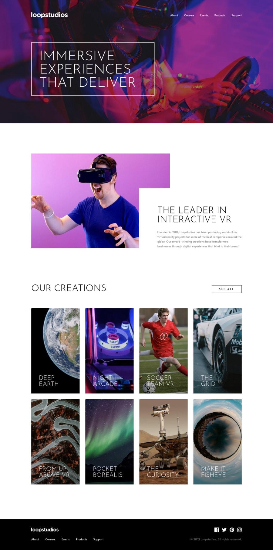
Loopstudios - Sass, intersection observer API, mobile first


Design comparison

Solution retrospective
Hello👋!
That was a simple and fun challenge, although there was room to try new things and learn something new.
- Implement
prefers-reduced-motionCSS media feature which is used to detect if the user has requested that the system minimize the amount of non-essential motion it uses. Prevent animations in brief. Spotted at @brasspetals solution 😅 - Added lazy load animations for cards. I did it with Intersection Observer API.
- Added sticky nav menu also using Intersection Observer API.
- Tried to create more accessible mobile navigation. Used the
aria-expandedandaria-controlsattributes. - As for the Sass part. In the project i used @use since it's recommended to using this instead of @import Kevin Powell video about it. Thanks to @RayaneBengaoui i saw his comment about this.
Thanks for @grace-snow for helping me with keyboard navigation. Since i change visible order of .creations I had to create other button to prevent firstly tab on last element and only then on first. No specific questions here but any additional feedback will be appreciated!
Thanks! 😁
Please log in to post a comment
Log in with GitHubCommunity feedback
- @truong231298
@tediko Your decision-making and problem-solving skills are incredible. i can't say anything beacause your code is so clean and easy to understand. moreover, you have some new ideas which i can learn more.
- @grace-snow
I really love this, and love the way you've thought things through.
Only a few very minor amends to suggest really ☺
alt="Home page"doesnt say the name of the site / product. Maybe consider a convention like Site - pageLoopStudios - Homeor similar- I don't think you need a negative tabindex on a span(?)
- the footer nav needs an aria label
- I'm not sure if the see all buttons should be button elements... I would expect them to trigger navigation so would probably use anchor tags there.
I'd need to test out how links wrapping figures and captions would be announced by a screenreader tbh, no idea about that one. It might be fine but I'm not sure.
- @ApplePieGiraffe
Hey there, yet again, tediko! 👋
Fantastic work on this challenge! 🙌 The sticky navigation bar is a great idea and the hover state of the cards in the "Creations" section looks great! 🤩 All of the other details (such as the "shake" animation on the social media icons and the transition of the mobile menu) are nice additions! 👍
Of course—keep coding (and happy coding, too)! 😁
- @Junjiequan
Hi tediko,
Your work just blown me away. Literally everything, animation, navbar transition, button hover effect, scss files architecture etc...
Im even getting a bit of envy feelings, just by looking at your scss structure, that is exactly how I want my code look like.
I really want to ask you how long have you been doing front end things, but I guess the answer won't help me in anyway.
Thank you so much for positing your solution, that gave me a direction to where I should be forwarded.
- @RayaneBengaoui
Hello tediko !
Nice to hear that you found comment helpful ! 😄
I really like all the animations you did on your solution, it looks super cool ! 🤩
I will definitely study your code, your Sass structure looks really clean and I didn't know about Intersection Observer API.
Have a nice day 🌞
- @brasspetals
Excellent job, tediko! 🙌 🎉
The “slide overlay and tilt zoom” hover effect on the cards is really neat, and I see you’ve added some extra animations to the social icon hovers! 😄👍 The fixed menu bar on scroll is also a nice touch, as well as the lazy loading - I’ll have to check out that API for myself! The whole project responds beautifully. Again, great job!
Thanks for the shoutout! 😊 I tested out reduced motion, and it seems to work perfectly. You might want to consider applying it to the hover state for the cards, or doing a simpler version for those who prefer it. It’s just a minor suggestion though, and I’m not sure it’s actually needed.
The only other small thing I noticed is that the image in the about section seems to peek out the bottom about 1px on the horizontal/desktop version. I can’t quite figure out what’s causing it. 🤔


Join our Discord community
Join thousands of Frontend Mentor community members taking the challenges, sharing resources, helping each other, and chatting about all things front-end!
Join our Discord