Huddle landing page with alternating feature blocks


Design comparison

Solution retrospective
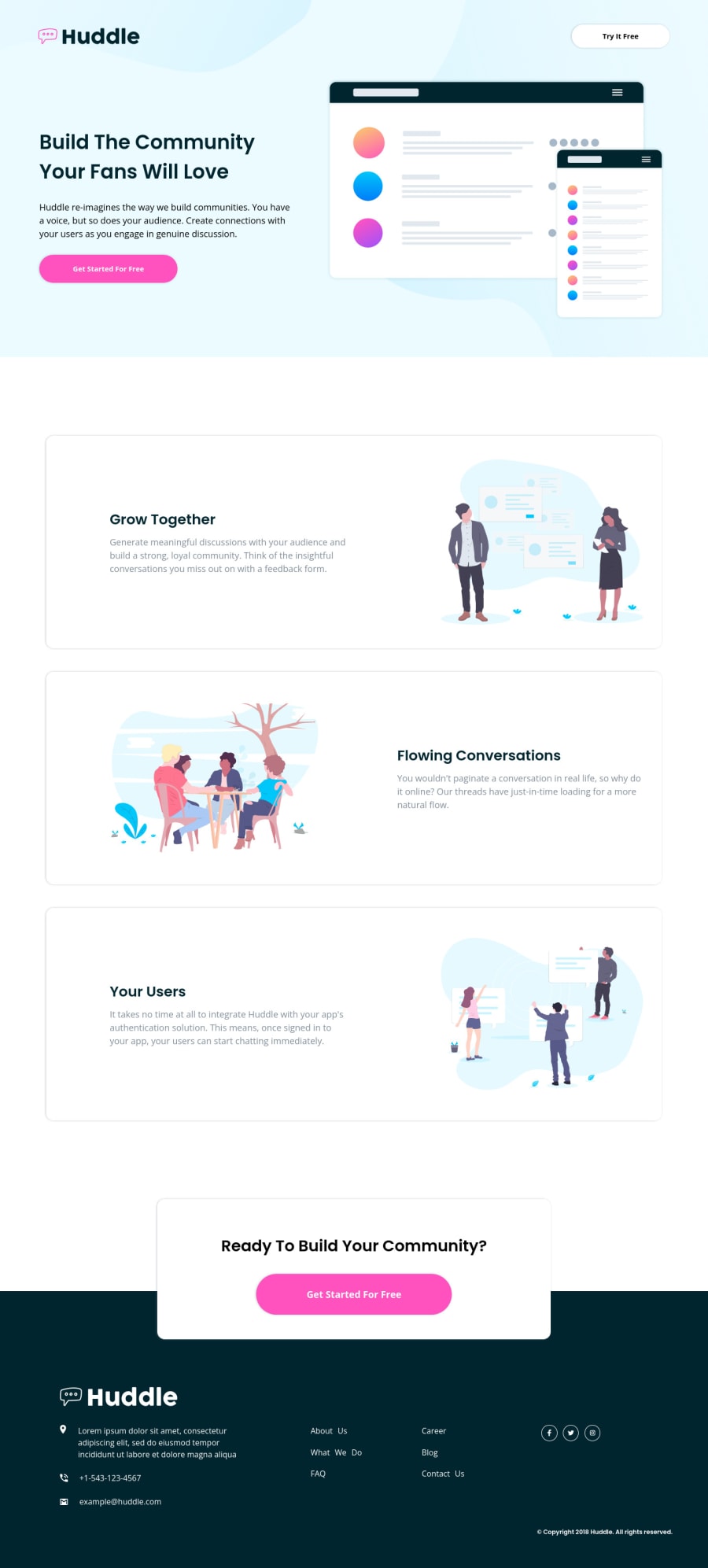
Hello, Frontend Mentor community! This is my solution to the Huddle landing page with alternating feature blocks.
I appreciate all the feedback you left that helped me to improve this project. Due to the fact that I published this project very long ago, I am no longer updating it and changing its status to Public Archive on my Github.
You are free to download or use the code for reference in your projects, but I no longer update it or accept any feedback.
Thank you
Community feedback
- @VCaramesPosted over 2 years ago
Hey there! 👋 Here are some suggestions to help improve your code:
- Your "buttons" were created with the incorrect element. When the user clicks on the button they should directed to a different part of you site to sign up. The
Anchor Tagwill achieve this.
- The
articleelement is not needed in this challenge, since nothing is site is independently reusable.
- The “Illustrations” serve no other purpose than to be decorative; They add no value. Their
Alt Tagshould left blank and have anaria-hidden=“true”to hides it from assistive technology.
- The "Ready To Build Your Community?" should be a
h2heading.
- As mentioned by the other user, the
footer“phone” and “address” should be wrapped inAnchor Tags, so users can easily click on them and have the appropriate app open for them.
- The
footerlinks need to be wrapped inside anavelement and should only be one single list.
- The “social media icons” are not decorative, they need to have an
Alt Tagwith a description.
If you have any questions or need further clarification, feel free to reach out to me.
Happy Coding! 🍂🦃
Marked as helpful2@catherineisonlinePosted over 2 years ago@vcarames Thank you for the feedback! Some questions:
- Where did you see that buttons are anchor tags? What if they open a modal window for registration, for example?
- Are articles used only for reusable blocks of code? I thought they separated the logic.
- Same questions regarding "Ready To Build Your Community?" being h2, is there a way to understand when it's h2 and when h3?
Thank you
0@VCaramesPosted over 2 years ago@catherineisonline
- While a modal can work, having a dedicated page for for signs up, will provide you with more flexibility than a modal and depending on company they might use a third party authentication system, that will require a a redirect. But if it's simple, like asking users an email and password, a modal will be fine.
- Reusable not just on your own site but also on other sites, think Yahoo, Ads, etc...
- It's a CTA section, so it hold a high ranking level. The
h2creates the sections of you site (think book chapters). Whileh3headings are for sub-sub-sections. For example, a section giving reason why a user should join:
 <section>
      <h2>Why Join</h2>
      <p>
        Lorem ipsum, dolor sit amet consectetur adipisicing elit. Dolor, sit
        deserunt!
      </p>
      <ul>
        <li>
          <h3>Lorem ipsum</h3>
          <p>dolor sit amet consectetur adipisicing</p>
        </li>
        <li>
          <h3>Lorem ipsum</h3>
          <p>dolor sit amet consectetur adipisicing</p>
        </li>
      </ul>
    </section>
Marked as helpful2@catherineisonlinePosted over 2 years ago@vcarames Makes sense, thanks 🙌🏻
2 - Your "buttons" were created with the incorrect element. When the user clicks on the button they should directed to a different part of you site to sign up. The
- @Yehan20Posted over 2 years ago
Congratulations on finishing the challenge, your solution looks amazing. I was wondering whether the email and number on the footer needs to be links or not , so when someone hovers, they can call or send a mail.
Marked as helpful1@catherineisonlinePosted over 2 years ago@Yehan20 yeah, I missed that out, thanks 😊
0 - @Pranshu-SahuPosted over 2 years ago
Hi @catherineisonline,
I am very impressed by the solution.
I wanted to know that how much time did it take you to complete such pixel perfect solution and at what screen do you make your solution for desktop screen.
1@catherineisonlinePosted over 2 years ago@Pranshu-Sahu Thanks! 😊 I am not sure about the time, I don't monitor it. I use a 1440x900 size display
0 - @Chams-satPosted almost 2 years ago
Hi .. congratulations for completing this challenge and I am very impressed by the solution. it's a pixel perfect 👌 💯
0 - @jahongirdevPosted over 2 years ago
Hi, how you creating without any errors?
0@catherineisonlinePosted over 2 years ago@jahongirdev When I first submit I also have errors and then try to fix them and refresh the report
0@jahongirdevPosted over 2 years ago@catherineisonline Got it, good luck for next projects :)
0@catherineisonlinePosted over 2 years ago@jahongirdev Thanks! You too! 🙌🏻
1 - @arashKazerouniPosted over 2 years ago
Congratulations! this is exact the same as desired design!! my solutions always have some differences with original design(even small differences, but your solution is completely fit). how did you do this?
0@catherineisonlinePosted over 2 years ago@arashKazerouni I am using Chrome extension called Perfect Pixel 😊
2@arashKazerouniPosted over 2 years ago@catherineisonline niiiiice!! thank you so much for made my life easier :)
0


Please log in to post a comment
Log in with GitHubJoin our Discord community
Join thousands of Frontend Mentor community members taking the challenges, sharing resources, helping each other, and chatting about all things front-end!
Join our Discord