

Design comparison

Solution retrospective
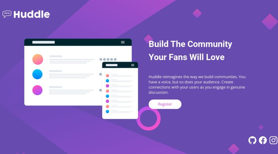
Frontend Mentor - Huddle landing page with single introductory section

This is a solution to the Huddle landing page with single introductory section challenge on Frontend Mentor. Frontend Mentor challenges help you improve your coding skills by building realistic projects.
Table of contents
Overview
The challenge
Users should be able to:
- View the optimal layout for the page depending on their device's screen size
- See hover states for all interactive elements on the page
Links
- Solution URL: Github
- Live Site URL: HUDDLE CHALLENGE
My process
Built with
- Semantic HTML5 markup
- CSS custom properties
- Flexbox
- CSS Grid
- Mobile-first workflow
Continued development
I plan on taking on the intermediate Huddle page challenge next and for that I'll need to learn SVG and how to use it in building a website, so that's definitely what i'm going for next.
Author
Community feedback
- @hitmorecodePosted over 1 year ago
Yes it's working now. I took a look and here are my tips.
<h3> build the community <br> your fans will love</h3>change thish3toh1. A page needs oneh1(you can only have one h1 on a page) this is for the search engine. The<br>you don't need this, you can remove it. This is creating a large empty space in the header.- When going to small screen size the logo doesn't change, on small screen size you need to change to a smaller logo.
- The logo and the social media icons are stretching in the width, they are touching the sides of the page. If you take a look at the design this is not the case.
- When the screen size goes below 1100px the content is of the center and the header font weight changes
- Somehow your image switch from desktop to mobile is not working properly
body{
font-family: 'Open Sans', sans-serif;
background-color: var(--violet);
background-image: url('images/bg-mobile.svg');
background-repeat: no-repeat;
background-size: contain; /* change to this */
color: var(--white);
max-width: min(90%, 1000px);
margin: auto;
min-height: 100vh;
display: flex;
flex-direction: column;
justify-content: space-around;
font-size: calc(1em + .6vw);
}

@media(min-width: 900px) { /* change to this to make a better transition from desktop to mobile */

body {
max-width: 100vw;
margin: 0;
background-image: url('images/bg-desktop.svg');
background-size: cover /* add this */
}
To keep the content in the middle of the page, wrap everything inside a container, give the container a width and make the content touch the sides of the container. You can use
margin: 0 auto;or flexbox or css grid to hold the container in the middle of the page.<body> <main> <div class="container"> place everything in here </div> </main> </body>1@LENI4CPosted over 1 year ago@hitmorecode ahh, thank you again, I'll change the background properties and the break point for when the property transitions, the placing in the middle/container, I actually left it the way it is cos I became fine with how it was looking 😂, then there's this h1 thing, I knew that h1's can be used but I didn't know it was compulsory if you weren't exactly creating like a lot of headings so the h1 can stand out as the main topic and every other heading tag would be a subheading, is there any real life application that setting it to h1 aids accessibility?
0

Please log in to post a comment
Log in with GitHub
Join our Discord community
Join thousands of Frontend Mentor community members taking the challenges, sharing resources, helping each other, and chatting about all things front-end!
Join our Discord