
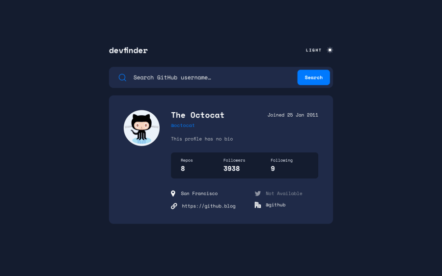
GitHub User Search App — Mobile-1st, SASS, BEM, API & JS.


Design comparison
Solution retrospective
Hi everyone! Thanks in advance for checking out my code! Any suggestions are welcomed! 😜
If you want to know how to find out if the user prefers dark or light mode based on their device preferences, check out my code, it took me a while to find out how to do it, but it was easier than I thought.
const darkOrLight = () => {
    const dark = window.matchMedia && window.matchMedia('(prefers-color-scheme: dark)').matches;
    if (dark === true) {
        console.log('User prefers dark mode');
    } else {
        console.log('User prefers light mode');
        document.body.classList.add('light');
    }
}
Happy coding! 😉✌
Community feedback
- P@remusbuhaianuPosted over 3 years ago
Hey Daniel, good job on completing this challenge. It looks awesome!
The responsiveness is there and all the features work as expected.
I think there's a bit too much space at the top of your container on larger screen sizes.
Also, I looked through your code and I think you could separate your mixins and variables inside other SCSS files to keep your file structure clean and maintainable.
Finally, you don't need JS for the user theme preference - you can achieve that using CSS
https://developer.mozilla.org/en-US/docs/Web/CSS/@media/prefers-color-scheme
Marked as helpful0 - @Sam-GulikerPosted over 3 years ago
Hi Daniel,
Looks good! To remove the HTML issues:
- Use an alt tag on your <img> tag
- If you use sections use a heading, else try to use a div
Happy coding
Marked as helpful0@DanyGlez94Posted over 3 years ago@Sam-Guliker Thank you! I already changed it and I have no more issues! 😁 Do you know why in my screenshot the background color looks darker than how it looks in the live site?
1@Sam-GulikerPosted over 3 years ago@DanyGlez94
I don't know, it might got to with the first paint or just a rendering issue. Have you tried RGB or HSL instead of HEX? I would just try that tbh.
0


Please log in to post a comment
Log in with GitHubJoin our Discord community
Join thousands of Frontend Mentor community members taking the challenges, sharing resources, helping each other, and chatting about all things front-end!
Join our Discord