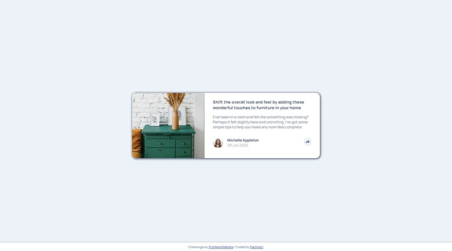


Design comparison

Solution retrospective
I successfully completed this project is a proud thing for me because I have left the practice for about 2 months especially I am still learning about javascript and still ask for help from ai
What challenges did you encounter, and how did you overcome them?on the share popup both in mobile and desktop mode it was the hardest thing I had to go through where the results I now get from ai. Therefore, I would like to ask for advice from other friends who saw my project if there is a way for me to better understand javascript without the help of ai as a beginner? depending on ai is very frustrating for me because I feel it is not my own ability.
What specific areas of your project would you like help with?all parts of html and css, if possible I will try to help on the beginner javascript part
Community feedback
- @jyoshida93Posted 3 months ago
Hey @Fbeye04,
Nice job on completing the challenge. I think you solution looks good and your code was well structured and easy to understand. I think something that might make your design look a bit better is using percentages for your card width rather than a fixed rem value. Doing this helps your design adapt to the screen size a bit better than having 1 width for mobile and 1 for desktop.
1

Please log in to post a comment
Log in with GitHubJoin our Discord community
Join thousands of Frontend Mentor community members taking the challenges, sharing resources, helping each other, and chatting about all things front-end!
Join our Discord