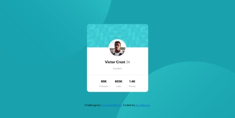
any feedback how can I improve are welcome
xZAYEDx
@xZAYEDxAll comments
- @aemrobeSubmitted about 2 years ago@xZAYEDxPosted about 2 years ago
Good job on completing this challenge.
- You might want to recheck your output as it's not adjusted for different device size's.
- Every element has to be adjusted for different device screens to achieve responsive web design overall you have a done a great job.
- Check out this article from W3 Schools to understand CSS Media queries
Marked as helpful0 - @oshudevSubmitted over 2 years ago
Hi! Eurus here.
Additional feedback or criticism will be appreciated. Thanks! 😁!
@xZAYEDxPosted about 2 years agoNicely done!!🤩 Could you please share some tips on how to achieve Pixel Perfect output just like this.
0 - @zyusuke10Submitted over 2 years ago@xZAYEDxPosted over 2 years ago
Hi zyusuke, congratulations on completing the challenge.🎉 You have not added the "alt text" for your image, here copy paste this code
<img src="image-equilibrium.jpg" alt="equilibrium-image">Also add the hover effect for the image, have a look at my solution for a better understanding! Happy Coding 😁
0 - @jesuisbienbienSubmitted over 2 years ago
I have a few questions:
- I used flexbox for this challenge but would love to know how to use grid on this.
- how to align the component vertically center? I don't know what I'm missing. Any other feedbacks are welcome too. Thank you!
@xZAYEDxPosted over 2 years agoGood job on completing the challenge. For the attribution div you need to add it inside a footer tag like this 👇🏽 that is after closing the main tag.
<footer>
 <div class="attribution">
    Challenge by <a href="https://www.frontendmentor.io?ref=challenge" target="_blank">Frontend Mentor</a>.
    Coded by <a href="https://github.com/jesuisbienbien?tab=repositories">Nguyen Nguyen</a>.
  </div>
</footer>
Just copy paste the above code 👆🏽 in your HTML file I have made it ready for you😁
Marked as helpful0 - @Hyuuga81Submitted over 2 years ago
My best attempt. Any tips on how to fill each grid. I noticed in the design file the content fills the whole box. Thanks in advance.
@xZAYEDxPosted over 2 years agoThe preview site looks very much different than the uploaded one. Also did you look into the flexbox? Make sure to adjust the margins and paddings as well. All the best 👍🏽
Marked as helpful0 - @haikalmolSubmitted over 2 years ago
- @andreasremdtSubmitted over 2 years ago
Hey there! This is my solution to the advice generator challenge. I added some animation sugar on top to make the UX smoother, hope you like it.
@xZAYEDxPosted over 2 years agoclean work, I like the animation you added for the button👍🏽
0 - @Hyuuga81Submitted over 2 years ago
This was an interesting challenge. Couldn't figure out the background pattern. Any advice? Thanks in advance.
@xZAYEDxPosted over 2 years agoRead my code in my GitHub, you will understand how I added the background pattern.
-- Link to my GitHub (https://github.com/xZAYEDx/profile-card-component-main
-- The code I used 👇🏽
-- background-image: url(../images/bg-pattern-top.svg), url(../images/bg-pattern-bottom.svg); background-repeat: no-repeat; background-position: right 52vw bottom 35vh, left 48vw top 52vh;
Marked as helpful1 - @steveWhoCodesSubmitted almost 3 years ago
- @AxurynnSubmitted almost 3 years ago
I added a feature: be able to modify the qr code on the fly. On firefox, color input does not work properly at first use. You must click on a color square before you can completely custom the color. On chrome, I think everything works well :)
@xZAYEDxPosted almost 3 years agoI loved the way you modified the challenge 😍 that was really impressive 💯✨
0 - @oshudevSubmitted almost 3 years ago
Hi! Eurus here.
Additional feedback or criticism will be appreciated. Thanks! 😁!
- @haikalmolSubmitted almost 3 years ago@xZAYEDxPosted almost 3 years ago
Good work no issues at all👍🏽 but your mobile version needs a little more work cos it's over lapping.
0


