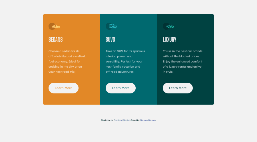
3-column-preview card component (use flexbox, how to use grid?)
Design comparison
Solution retrospective
I have a few questions:
- I used flexbox for this challenge but would love to know how to use grid on this.
- how to align the component vertically center? I don't know what I'm missing. Any other feedbacks are welcome too. Thank you!
Community feedback
- @tiagobwPosted almost 3 years ago
Hi Nguyen,
For the Desktop view:
1To use CSS Grid instead of Flexbox, change themainstyles to:main { display: grid; grid-template-columns: repeat(3, 20rem); }For the mobile view:
1To use CSS Grid instead of Flexbox, change themainstyles to:main { display: grid; grid-template-columns: 20rem; }2@Hersonmei's answer is already great.I hope that helps.
Have a great day. :)
Marked as helpful0 - @HersonmeiPosted almost 3 years ago
2 - To center your main on the page, you can apply the flex display in the body.
Your body will look like this:
body {
  font-family: "Lexend Deca", sans-serif;
  font-size: 1rem;
  background-color: var(--very-light-gray);
  height: 100vh;
  width: 100vw;
  display: flex;
  flex-direction: column;
  justify-content: center;
}
Marked as helpful0@jesuisbienbienPosted almost 3 years ago@Hersonmei thank you. Not sure why I never thought of that :)
1 - @xZAYEDxPosted almost 3 years ago
Good job on completing the challenge. For the attribution div you need to add it inside a footer tag like this 👇🏽 that is after closing the main tag.
<footer>
 <div class="attribution">
    Challenge by <a href="https://www.frontendmentor.io?ref=challenge" target="_blank">Frontend Mentor</a>.
    Coded by <a href="https://github.com/jesuisbienbien?tab=repositories">Nguyen Nguyen</a>.
  </div>
</footer>
Just copy paste the above code 👆🏽 in your HTML file I have made it ready for you😁
Marked as helpful0
Please log in to post a comment
Log in with GitHubJoin our Discord community
Join thousands of Frontend Mentor community members taking the challenges, sharing resources, helping each other, and chatting about all things front-end!
Join our Discord
