Not Found
Not Found
Not Found
Not Found
Not Found
Not Found
Not Found
Not Found
Not Found
Not Found
Not Found
Not Found
Not Found
Not Found
Not Found
Not Found
Not Found
Not Found
Not Found
Not Found

All comments

  • @cathleys

    Submitted

    Hi guys!

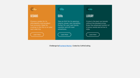
    I'm done with this 3 column card. I started yesterday with this challenge and just finished it today. I'm still in the learning-so-much phase as a newbie.

    I have one newbie problem and that is I couldn't make the border-radius work inside the .flex-container class. It was working at first but then when my codes started to get long as I build more for other classes, it didn't work already. Can you help me fix this issue?

    How do you make the sentence => /*Challenge by Frontend Mentor...Coded by ****/ , be at the center of the page and just stay at the end of the screen no matter the screensize is?

    and lastly, If you have a better way or suggestion to make my css codes look clean or whatnot. please tell me.

    I would love to hear your code reviews!

    Thank you for your generosity! :')

    Wesley 330

    @wesleyjacoby

    Posted

    Hi!

    Well done on completing this challenge!

    I'm also a newbie, so I can't answer all your questions, unfortunately.

    For the border radius issue though - What I found worked for me was putting overflow: hidden; in your .flex-container.

    Hopefully, someone with more experience can answer your other questions.

    Keep up the good work!

    0
  • charmonder 260

    @charmonder

    Submitted

    Hello, everyone! A noob here. I finished this challenge, but I wonder if there's a way to make the profile image stay at the center of two divs no matter what you do to the viewport? At the moment I centered it very manually using pixels. Thanks so much for your help!

    Wesley 330

    @wesleyjacoby

    Posted

    Hi,

    Congrats on completing the challenge!

    Fellow noob here and I also struggled with the positioning of the profile image. Here's what worked for me.

    On .profile-image img, remove position: absolute and top: 240px and add the following lines:

    position: relative;
    margin: 0 auto;
    transform: translateY(-50%);
    

    You may need to experiment with the translateY percentage. Here's some documentation on translateY.

    I hope that helps, or gets you closer to the result you're looking for.

    1
  • tomatas95 50

    @tomatas95

    Submitted

    Hm, I wonder why my "margin:auto: nor display flex with align-items & justify-content centers didn't work , had to manually use margin-tops to center them..

    Flex method only centered the content themselves, even though I targeted the container itself.

    Margin:auto, only had targeted left & right, but didn't work for top & bottom. Any ideas?

    Thanks!

    Wesley 330

    @wesleyjacoby

    Posted

    Hi,

    To center the card/container, you could add the following to the body:

    display: flex;
    justify-content: center;
    align-items: center;
    min-height: 100vh;
    

    The min-height: 100vh being the important bit. Then you can remove the margin-top from the container.

    This is a great article showing different methods of centering in CSS

    I hope this helps!

    Marked as helpful

    1
  • Wesley 330

    @wesleyjacoby

    Posted

    Hi Ramdan,

    Congratulations on completing the challenge!

    To center your card, you could use the following code on the parent (body in your case):

    display: flex;
    justify-content: center;
    align-items: center;
    min-height: 100vh;
    

    This is a great article on centering in CSS

    I hope this helps!

    Marked as helpful

    0
  • Wesley 330

    @wesleyjacoby

    Posted

    Hi Luci,

    Amazing job with your first solution!

    If you want the letters in the word "perfume" to be spaced apart more, you could use the letter-spacing property.

    Similarly, if you'd like more spacing between the lines in the paragraph/item description, you could use the line-height property.

    Well done again! :)

    Edit: Oh wait, I see you used letter-spacing. Nice!

    Marked as helpful

    0