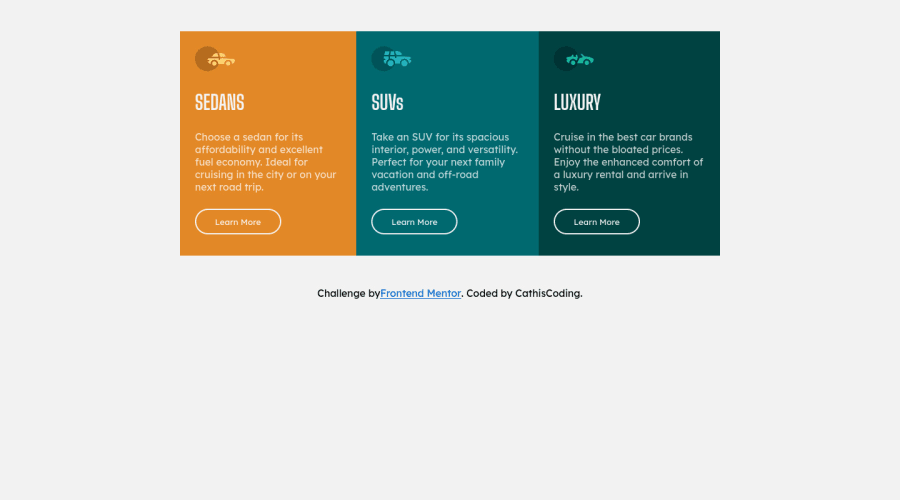
Design comparison
Solution retrospective
Hi guys!
I'm done with this 3 column card. I started yesterday with this challenge and just finished it today. I'm still in the learning-so-much phase as a newbie.
I have one newbie problem and that is I couldn't make the border-radius work inside the .flex-container class. It was working at first but then when my codes started to get long as I build more for other classes, it didn't work already. Can you help me fix this issue?
How do you make the sentence => /*Challenge by Frontend Mentor...Coded by ****/ , be at the center of the page and just stay at the end of the screen no matter the screensize is?
and lastly, If you have a better way or suggestion to make my css codes look clean or whatnot. please tell me.
I would love to hear your code reviews!
Thank you for your generosity! :')
Community feedback
- @wesleyjacobyPosted over 2 years ago
Hi!
Well done on completing this challenge!
I'm also a newbie, so I can't answer all your questions, unfortunately.
For the border radius issue though - What I found worked for me was putting
overflow: hidden;in your.flex-container.Hopefully, someone with more experience can answer your other questions.
Keep up the good work!
0
Please log in to post a comment
Log in with GitHubJoin our Discord community
Join thousands of Frontend Mentor community members taking the challenges, sharing resources, helping each other, and chatting about all things front-end!
Join our Discord
