Not Found
Not Found
Not Found
Not Found
Not Found
Not Found
Not Found
Not Found
Not Found
Not Found
Not Found
Not Found
Not Found
Not Found
Not Found
Not Found
Not Found
Not Found
Not Found
Not Found

All comments

  • @rojaence

    Submitted

    This is my first project with Vue3 and Pinia.

    My main concern in this challenge was performance, so I developed a pagination control that limits the number of DOM elements that are rendered when filters are applied. I chose this paging solution because I found it easy to implement. Has it been a good choice?

  • Flor 10

    @floor096

    Submitted

    -For this i mostly used Flexbox -I had a little dificult time while building the mobile version I would like to recieve some feedback and recommendations Thank you!

    Warren 630

    @warrenlee

    Posted

    Hi Flor, good job on this challenge! Desktop looks perfect but here's a tip on how to start getting the layout respond for mobile.

    Starting with #conteiner change width to 100% and height to auto and add flex-direction: column. On your #img change the width to 100% and since you are using background-image you'll need to set the correct background-image url, add either padding-top to give the element some height or you can use the newly introduced aspect-ratio. Spotted a minor mistake, background-repeat should be set to no-repeat rather than none

    Next, you'll need to sort out the border-radius. I'd recommend to apply it on the #conteiner and adding overflow: hidden to make the rounded corners visible. I would also recommend using the picture tag instead of background-image as you can use media queries to set the image you want to show.

    example:

    <picture>
        <source srcset="/desktop-img.jpg" media="(min-width: 768px;)">
        <img src="/mobile-img.jpg">
    </picture>
    

    I hope this helps!

    Marked as helpful

    0
  • @Triad01

    Submitted

    Hi guys. I just finished this project. I found it difficult changing the svg icons in the navigation menu when they are hovered. pls take a look at my codes and sugggest how I can do this.

    Any suggestions as to how I can improve this generally is also welcome. Thanks

    Warren 630

    @warrenlee

    Posted

    Hey chigboo, in regards to your issue you can try using the CSS property transform it has a behaviour where you can rotate elements.

    On hover try applying the following onto the SVG icon.

    transform: rotate(180deg);
    

    And the icon should flip 180. Hope that helps.

    Marked as helpful

    0
  • P

    @AlexandruStefanGherhes

    Submitted

    Tried using the picture element and the img element with srcset to have the images switch at certain breakpoints but the browser was reading only the src image so it was not working, eventually i switched to background img with media query breakpoint, but the mobile img zoomes in as you increase the with of the viewport.

    Any advice would be appreciated!

    Warren 630

    @warrenlee

    Posted

    Hey Alexandru, good work on the challenge, I think how you tackle the image using background-image with grid works well quite! But as you've pointed out the image for mobile zooms and that's because of the CSS property background-size: cover and the also the way grid cells behave where all cells have the same dimensions according to the large cell.

    If you want to look back into the picture solution again have a look at my take on this. https://bitbucket.org/warrenlee/frontend-mentor/src/7d9890d17383b78420d658897ccfe816ee62f71a/product-preview-card-component/index.html#lines-14:17 Just make sure you use media="min-width: XXpx" rather than max-width in the source tag and make the source cascade so that large min-width starts from the top.

    Hope that helps!

    Marked as helpful

    1
  • Warren 630

    @warrenlee

    Posted

    Hey Mateus, good on job on tackling the challenge. I also had a go at least and I agree, coding the layout is easy as there is a lot of tweaking with the positions in order to get them in the right places. With the box-shadow, I think you've nailed it there and I would recommend spreading them out evenly, like have spread out in multiples of 30 and add a transition property to give it that smooth spread when appearing.

    box-shadow: 
        rgba(255, 255, 255, 0.09) 0px 0px 0px 30px, 
        rgba(255, 255, 255, 0.06) 0px 0px 0px 60px, 
        rgba(255, 255, 255, 0.03) 0px 0px 0px 90px;
    transition: box-shadow 500ms ease;
    

    Hope that helps!

    Marked as helpful

    0
  • @anglicus

    Submitted

    I thought this would be a fairly easy challenge, but the layout presented some tricky problems that weren't obvious on first glance. I'm fairly satisfied with my solution, though I'm sure my code could use improvements. Suggestions welcome. I tested on a variety of devices to ensure consistent performance, but if anyone notices weird behavior or a bug, let me know.

    Navigation of the slideshow can be done via clicking on the buttons, arrow keys, or swiping left/right on a touch-enabled device. The light box can also be opened and closed with the space bar.

    Warren 630

    @warrenlee

    Posted

    Hey James, good work! I am currently on a 27" screen and the layout for both homepage and slideshow looks very spaced out so you might want to add a container/max-width to prevent this from happening, and the snap of the slideshow doesn't seem to flow very smoothly, especially at the end where it snaps a little awkwardly, but that's just my preference. Other than those, seems to work flawlessly! Good job on that

    Marked as helpful

    1
  • Warren 630

    @warrenlee

    Posted

    Hi HelenJonathan, you are almost there!

    With the CSS background property, you can define the background position, background size and decide if the background should repeat or not and also add some background color.https://www.w3schools.com/css/css_background_shorthand.asp

    You try extending your property a bit by setting the background position to top, set background repeat to no-repeat and add a background color to finish off.

    1
  • Satyam Jha 400

    @satyammjha

    Submitted

    Hey, community this is my solution for the interactive rating component challenge. I have a few questions:-

    1. How to pop up a warning when the rating value is not selected?
    2. How to change the background color of the selected rating when another rating is selected It would be helpful if you could answer my questions. Other feedback is also appreciated.
    Warren 630

    @warrenlee

    Posted

    Hey Satyam, looking at your code, in your submitbtn event listener for click I would check if selectedrating is defined/not empty before deciding to show the thank you message.

    For your second question in your function ratingdisplay you would typically do a reset before firing the selected state, and I would use classes and it'll make things easier and concise.

    What you have now is this.

    function ratingdisplay(event) {
      ratingbutton.forEach(() => {
        event.target.style.backgroundColor = "hsl(25, 97%, 53%)";
        event.target.style.color = "white";
        selectedrating = event.target.value;
      });
    }
    

    Firstly the forEach loop is redundant as it's apply the same styles to the same element, so instead I would use this forEach loop to reset the styles to what they were before and then apply the active state after.

    function ratingdisplay(event) {
      ratingbutton.forEach(() => {
        // reset your styles for each ratingbutton here
      });
    
      // apply selected state here
      event.target.style.backgroundColor = "hsl(25, 97%, 53%)";
      event.target.style.color = "white";
      selectedrating = event.target.value;
    }
    

    But if you use classes instead.

    function ratingdisplay(event) {
      ratingbutton.forEach((el) => {
        // reset your styles for each ratingbutton here
        el.classList.remove('selected');
      });
    
      // apply selected state here
      event.target.classList.add('selected');
      selectedrating = event.target.value;
    }
    

    Or even better still do comparison checks and use toggle instead.

    function ratingdisplay(event) {
      ratingbutton.forEach((el) => {
        // Use toggle to evaluate if the class should be added or removed
        el.classList.toggle('selected', el.value === event.target.value);
      });
    
      selectedrating = event.target.value;
    }
    

    Hope this helps

    Marked as helpful

    1
  • Warren 630

    @warrenlee

    Posted

    Hey cacosted, I know that the current filesystem works for larger projects where each component has it's own index.jsx file and style.js file but since this project is rather simple and all your index.jsx are relatively the same, I would just remove all the index.jsx files and rename the style.js to index.js. But in terms of theory, I think what you have is correct. Each element with its logic should be a component so that it can be reused in other places of the application. Maybe try one of the projects under the Junior level, where I think you can do more with React components.

    Marked as helpful

    1
  • Warren 630

    @warrenlee

    Posted

    Hey Artem, I would definitely go with using Formik. It'll make implementing forms easier as I personally think implementing forms is a nightmare.

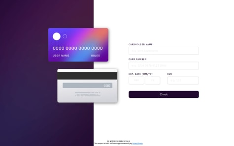
    Here is my take on the challenge https://bitbucket.org/warrenlee/frontend-mentor/src/master/interactive-card-details-form/

    I used an if/else to determine whether to show the form or the thank you message. Feel free to browse my code and take away some inspiration if it helps!

    Marked as helpful

    0
  • @CoderKnight02

    Submitted

    Hey, I am back with my third problem solved. I found this challege interesting because positioning the circles on the background gave me a little trouble, at firts i tried doing it with responsive dimentios until I found out that the circles wer not streching or shrinking (my opinion analizing the design image) so I used a trick with min-height and min-width on a container. If you have any suggestions on how to do it differently please let me know.

    Warren 630

    @warrenlee

    Posted

    Hey Manuel, I think you can give this a try. Instead of using img tags, I used the CSS background image. If you didn't know you can actually use multiple images on the same property.

    On your .cont element I would set the height to min-height: 100vh and add the background CSS property with this value. background: url('./images/bg-pattern-top.svg') -50% 400% no-repeat, url('./images/bg-pattern-bottom.svg') 160% -300% no-repeat; (You may see a gap at the top of the screen. Thats because the body tag has margins set by default, so you'd want to reset those by adding margin: 0; padding: 0; to the body tag.) Give it try, if the positions look out of place try tweaking the percentages. See if that works for you.

    Marked as helpful

    0
  • David 80

    @DavidSosaMoriana

    Submitted

    For some reason that I couldn't fix, the desktop image for the crew page is not filling completely. If anyone know what did I messed up here, feedback is welcome!

    Warren 630

    @warrenlee

    Posted

    Hey David, try adding min-h-screen to your section.crew element. It's because your content only goes as far as the description under the name so your element ends there. With min-h-screen aka min-height: 100vh, you are setting the height of the element to be 100% of the screen height.

    Marked as helpful

    0