vjaimes
@vjaimesAll comments
- @BrandaoA@vjaimes
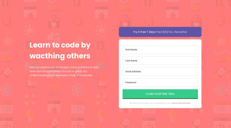
nice job on this, only issue I saw was that the email input field spans across the entire screen around 940px is also the same for larger screens. Functionally this isn't a problem, but from a design perspective it stand out a lot. same for the paragraph. other than that, nice job :)
- @BrandaoA@vjaimes
This is very good, though I think the code you have can be shortened. your inputs share a class so you can use querySelectAll to get all of them and then filter them by id whenever you need to validate them. A similar approach can be done for your error messages using "id" or the "data" attribute.
This is only my perspective though. I understand we all have our own coding styles so take this with a hint of salt. this is the approach I took, so feel free to look at my code whenever you want to :D
Marked as helpful

