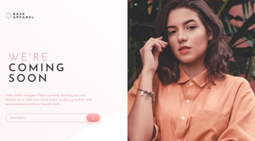
Submitted over 2 years agoA solution to the Base Apparel coming soon page challenge
Base Apparel
@BrandaoA

Solution retrospective
waiting for other solutions on how this could have been done. I had a problem with the logo display so i had to create two logos and hide one while doing the mobile view and vice versa for the desktop view.
Code
Loading...
Please log in to post a comment
Log in with GitHubCommunity feedback
No feedback yet. Be the first to give feedback on Brandon Alobwede's solution.
Join our Discord community
Join thousands of Frontend Mentor community members taking the challenges, sharing resources, helping each other, and chatting about all things front-end!
Join our Discord