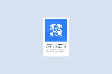
This challenge really challenged and taught me how to use grid. I was proud how quickly I was able to pick up how to use it. For a long time I've just been using flexbox to cut corners but I feel pretty good about using grid now.
What challenges did you encounter, and how did you overcome them?I completed everything on the mobile-first side then used Kevin Powell's CSS Grid video as a resource. It turned out to be the same as this challenge. While I did get a lot of help and inspiration from the video, I tried my best not to re-do what I already had and instead tried to go as far away from copying the video as possible.
I did however, come out of it with points of how he named his CSS classes, how not to over-use CSS classes, and a strong foundation in understanding grid layouts.
What specific areas of your project would you like help with?There were a lot of points in the design where I had to eyeball and I tried my best on getting the coloring and shadows accurate.
I wasn't 100% satisfied with how the cards look under certain viewpoints, for example if the window was too small but just enough to hit breakpoint, some desktop view cards would be extremely elongated vertically. There are also other times where the cards have a lot of whitespace for the smaller ones.
I also noted that the style guide said to use 500/600 font weight, but I don't think the design actually used 500/600, some of the text had lesser weight to it.
Any suggestions on how to fix any of these issues and if there are any structural, refactoring, or standard practices that I should apply to my HTML/CSS would be greatly welcomed!


