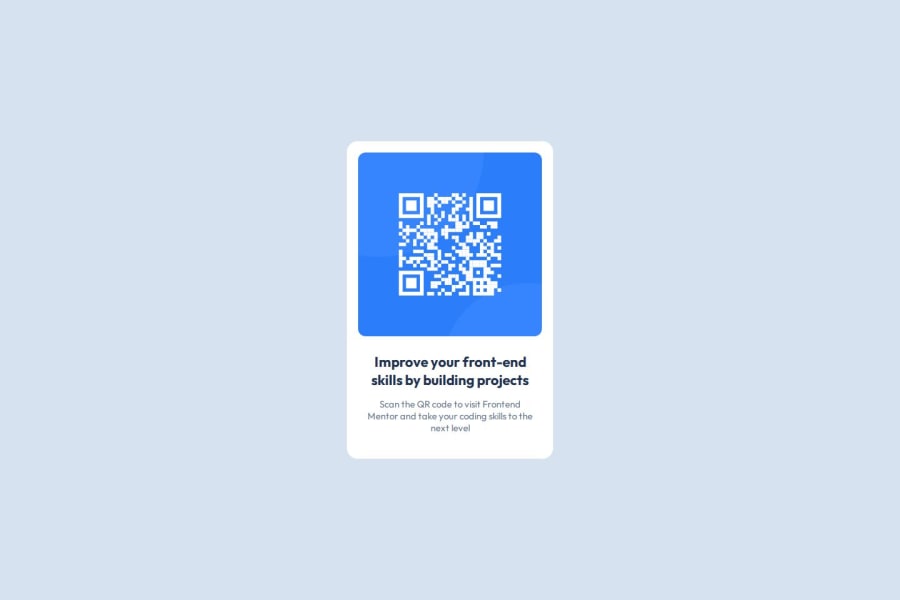
Design comparison
Community feedback
- @valen-webdPosted 29 days ago
Wow, your solution looks really close to the original design – great job on that! 🎉
One small suggestion for the code: It might be easier to read (and more accessible) if you used more semantic HTML elements like <main> and <footer> instead of only <div>. This can help with structure and improve accessibility.
Also, grouping similar CSS rules together (for example, the two .attribution stylings) could make the stylesheet a bit more organized. Just a small detail, but it might help in larger projects! Keep up the great work. 😊
Marked as helpful1
Please log in to post a comment
Log in with GitHubJoin our Discord community
Join thousands of Frontend Mentor community members taking the challenges, sharing resources, helping each other, and chatting about all things front-end!
Join our Discord
