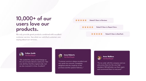
What are ways I can make the positioning better? I feel like I'm not using the right properties.
Maycon
@traceurmayconAll comments
- @noopur0210Submitted over 2 years ago@traceurmayconPosted over 2 years ago
Nicely done. You have to update your report to take away this accessibility issue. To answer your question. You did great with the properties. If you are talking about centralize the layout, you have to make
body100% of the viewport height and useflexin it. Align horizontally withjustify-content: centerand vertically withalign-items: center. Didn't test this myself, but that's the general idea.UPDATE: You updated the report while I was writing this comment so desconsider this part. Congratulations for the amazing work.
Marked as helpful0 - @joeygilSubmitted over 2 years ago@traceurmayconPosted over 2 years ago
Hello there. Congratulations for completing the challenge. I took a time to review your code and I have some points to add.
- You have a few issues with algorithm that, in resume, you can solve just adding
altto your image and put all your content into a<main>tag and the.atributionclass inside a<footer>tag. - You have more space on the right side of the card than the left. Centralize it!
- Your
<h3>must be substituted to a<h1>since all pages must have one. And you have to adjust the size of it. - You need to change the colors of the texts.
- You can centralize your card using flexbox. Absolute positioning is a no-no since you don't have responsiveness with it. Just using media queries.
- To finish, I always say that "less is more". So you can throw all useless code like the
<div>s wrapping the image and the title. You don't need 'em.
But great job. It's great to be willing to at least try to do it. And it's even better to get it. Congratulations again.
PS: Sorry for the bad english. I'm still learning. xD~
Peace!
0 - You have a few issues with algorithm that, in resume, you can solve just adding
- @LakorthusSubmitted over 2 years ago
soorryy guys this background was a challenge.. i could not see it properly =( can someone send me a push of the bg?
many thanks
@traceurmayconPosted over 2 years agoI had the same problem with the background. Anyway, you have to adjust your
font-weights and your project will be crispy.Marked as helpful1


