
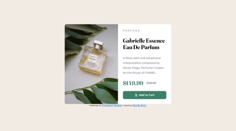
@ZachcoproSubmitted over 2 years ago

Gustavo de Camargo Campos
@themegazordAll comments
- @themegazordPosted over 2 years ago
Hi, @Zachcopro.
First, congratulations for your effort and for having managed to finish another exercise with us.
I saw in your project, that the div was not fully centered in the middle. You can fix this by inserting a min-height: 100vh and a flex-direction: column in your body, as stated below.
body {
    display: flex;
    flex-direction: column;
    justify-content: center;
    align-items: center;
    min-height: 100vh;
}
I hope I have helped you for your next projects.
Mark as helpful and give me an up vote if you think this was good for you. Thank you and see you next time.
Marked as helpful0 - @idlehands1969Submitted over 2 years ago
This is my first Frontend Mentor challenge and I want to make sure I have followed the challenge instructions correctly. The style-guide says the designs were created to 375px and 1440px respectively for the mobile and desktop versions. Did this mean the width of the document body or the card itself? I assumed it was the body and gave the card a fixed width of 720px for desktop and 375px for mobile. The desktop version was way too big at 1440px wide in my opinion. However, I would make it that big if that was the requirement.
It took me many tries to finally get the code to work the way I wanted it to. I first tried flexbox, then css grid, and ultimately bootstrap was the only way I could get the image and non-image sections to be the same height, although that may be because I finally gave the card a fixed width in both versions. I'm not sure.
Constructive criticism would be appreciated.
@themegazordPosted over 2 years agoHello my dear.
First of all, congratulations for your effort in finishing your first project here with us :)
Next, when he says 1440px Desktop and 375px Mobile, it's the size of the screen itself and not the card. The card will have to adapt to all dimensions between 1440px and 375px.
So your card should follow the following logic:
375px < your card < 1440px.
Adaptations will be given responsively, using @media.
Second, it's ok for you to use Bootstrap, being that it was the only way you could but the ideal was to try with CSS Flex or CSS Grid.
A tip, for you to center everything in the center, you can use the following:
body{ display: flex; flex-direction: row; justify-content: center; align-items: center; min height: 100vh; }
This will make your card stop in the middle, the rest you will adjust according to what is necessary. If you want, I'll leave my repository of this exercise for you to see how it looks.
Hope this helps.
If possible, mark as helpful :-)
It helps me a lot.
Github: https://github.com/themegazord/Product-Preview-Card-Component Live Site: https://incandescent-phoenix-6d0d26.netlify.app
Marked as helpful0 - @murilopitaSubmitted over 2 years ago
All feedback is welcome! Thank you! :D
Todo feedback é bem-vindo! Obrigado :D
@themegazordPosted over 2 years agoBoa Murilo, parabéns pela sua entrega :-)
Marked as helpful0 - @amit-kumar-18Submitted over 2 years ago
- The image in thank you window seems to load slower than the rest of the page.
- Submit button has a weird outline on the upper corner.
These are my main concerns any other feedback is most welcome. " I have created a fun little animation on the star feel free to explore."
@themegazordPosted over 2 years agoHi Amit Kumar, congratulations on the solution.
Answering your question, the weird border, you would have to use the border: 1px solid transparent; to 'take off' any border that might be, since we set it to transparent.
Corresponding to the delay when loading the image, try just creating it via HTML, and just set or not display: none, in the div to disappear and continue respecting display: flex the next time it stays.
One last tip, the organization of your folders, you can create an assets folder and inside it create two more, with the name css and js and inside each, insert the responsible file for each folder.
Don't forget to mark it as helpful :-)
0 - @themegazordSubmitted over 2 years ago@themegazordPosted over 2 years ago
Eu cheguei a colocar o media query, será que não funcionou no Netlify?
@media screen and (max-width: 450px) {
body {
    background-image: url('../../images/pattern-background-mobile.svg');
    background-repeat: no-repeat;
    background-size: 100vw;
}

.content {
    width: 350px;
}
}
0 - P@haydnkerrSubmitted over 2 years ago@themegazordPosted over 2 years ago
Hi Haydn Kerr, congratulations on the solution.
I have some scores to make for you to improve more and more.
1st Use classes and id in your HTML so that you can use them in CSS, this may not have been a problem, but imagine in a larger project, if you are guided only by HTML tags to assemble your CSS, you will become a monster kkkkk.
2nd In your CSS, it might be easier if you use :root and declare the color variables for your project, so instead of writing the hsl every time you tell the browser that it will be called for example --primary -white or the color you want.
Keep it up, you only tend to grow, congratulations.
Marked as helpful1 - @kamilp522Submitted over 2 years ago
I've had a problem with adding border radius to my .card_container element. Any thoughts?
@themegazordPosted over 2 years agoHi Kamil, how are you?
Another thing I noticed, you inserted the mobile image in the desktop version.
Marked as helpful1 - @themegazordSubmitted over 2 years ago@themegazordPosted over 2 years ago
Fala aí, Lucas, tudo sim e com você?
Então cara, eu estou começando agora no front-end, estou me adaptando ao full-stack, visto que já sou back-end e no momento eu tenho mais segurança separando tudo por div, mas com o tempo vou separando as coisas para ter apenas uma div.
Muito obrigado pelo feedback, vou tentar nos próximos desafios para tentar fazer isso que você disse.
Fique bem :-)
1 - @themegazordSubmitted over 2 years ago@themegazordPosted over 2 years ago
Hi Muhammed. Thanks for the feedback, it's my first project as a front-end, primarily I'm a back-end developer.
I will try to improve based on your feedback.
1