@hannahro15 hi !
Congratulations on completing this challenge. However, I have some suggestions for the same.
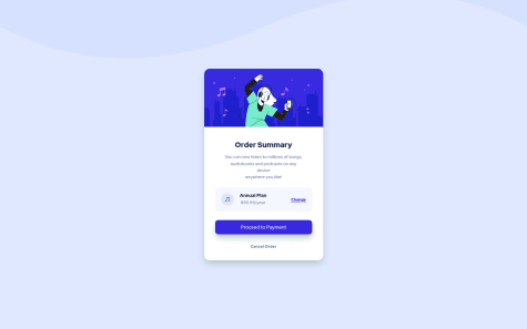
first about your question it may be that you designed your project specific to a width which wasn't 1440px as the ss here it takes the image of how your project looks at this width which is a desktop width generally.
HTML: I suggest you make a div around all the written part (like .text)so that its easier to place as all are aligned to each other.
CSS : Here don't repeatedly use the same things and write your code again as you have done for box-1,2,3 and number-1,2,3 and text-1,2,3. as they all have the same style just give them the same class and write the code once only. and in number and text you don't even need to give classes as they have different tags eg:
    margin-bottom: 5px;
    font-family: "Inter";
    color: hsl(0, 0%, 100%);
}

h4 {
    font-size: 8px;
    font-family: "Inter";
    color: hsla(0, 0%, 100%, 0.6);
}
/* since they have the same font family you can just give this font family to all */
don't give padding to div since it gives space between img and container instead give padding to text you have wrapped around all the written parts. And also don't give flex-container 100px rather 100% width so that it can place the contents in it all over the .text
.text {
    padding: 5%;
    width: 45%;
}

.flex-container {
    width: 100%;
    display: flex;
    justify-content: space-between;
    align-items: center;
    text-align: center;
}
for making it responsive I suggest using flex and making the width and height of the container auto and making the width of the picture 100%
@media screen and (max-width:800px) {
    .container {
        display: flex;
        flex-direction: column;
    }
    main {
        width: auto;
        height: auto;
        overflow: hidden;
    }
    img {
        width: 100%;
    }
    .text {
        width: 90%;
    }
}
for the purple part in the image, you can give the colour to imgdiv and lower the opacity of the img
.imgdiv {
    background-color: hsl(277, 61%, 48%);
}

img {
    opacity: .5;
}
also, add border-radius to the container
I hope this helps :)
happy coding !!


