Not Found
Not Found
Not Found
Not Found
Not Found
Not Found
Not Found
Not Found
Not Found
Not Found
Not Found
Not Found
Not Found
Not Found
Not Found
Not Found
Not Found
Not Found
Not Found
Not Found

Submitted

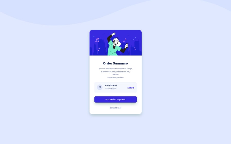
Order Summary challenge - Flexbox and Grid

Francisco Pradoβ€’ 80

@franciscoprado4

Desktop design screenshot for the Order summary component coding challenge

This is a solution for...

  • HTML
  • CSS
1newbie
View challenge

Design comparison


SolutionDesign

Solution retrospective


Attempt 3. Of matching my work with the preview slider of Frontend Mentor. If you have any tips on how to match the projects with the slider of the preview of frontend mentor would be apreciated.

Community feedback

Travolgi πŸ•β€’ 31,420

@denielden

Posted

Hi Francisco, great work on this challenge! πŸ˜‰

Here are a few tips for improve your code:

  • for fix the top image in the background just put more specific background properties to the body:
background: url("../img/pattern-background-desktop.svg") no-repeat top center;
background-size: contain;
background-color: #e0e8ff;
  • use p not the h3 tag for the text of card
  • instead of using px use relative units of measurement like rem -> read here

Overall you did well 😁 Hope this help!

1

Francisco Pradoβ€’ 80

@franciscoprado4

Posted

@denielden Great feedback, definitely will use this. Regards.

I'm still finding the best way to use units, sometimes i use rems and px for different cases.

1
Melwynβ€’ 250

@melwynt

Posted

Hi! πŸ‘‹

These are the tools that you can use to make pixel-perfect versions:

  • Pixel Perfect Pro - This helps me to display a screenshot on top of the webpage to easily check if dimensions were accurate. This is super useful is you need to create pixel perfect work.
  • PX: Viewport Dimensions - This add-on will show you the dimensions of your viewport while resizing your browser.

Other tools:

  • Figma - This helps me create a rapid mockup to get dimensions of components.

Cheers

1

Francisco Pradoβ€’ 80

@franciscoprado4

Posted

@melwynt Thanks i definitely use those tools. I checked you work and its amazing.

:)

1
Melwynβ€’ 250

@melwynt

Posted

@franciscoprado4 thanks πŸ˜€

0
Tabassum Fatimaβ€’ 215

@tab21

Posted

@FranciscoPrado04 Hi!

Congratulations on completing this challenge.

Here I have some suggestions to improve:

First, in HTML at line 25, you have a closing tag </h2> which doesn't have a starting tag. So you can remove that or you can use h2 instead of h3 in .tittle-text. It should also remove the accessibility issue.

Second don't use the <br> tag repeatedly instead just make the width of .tittle-text as width: 100%; this will adjust the text like in the design. And in the future too it's better to not break lines using the <br> repeatedly tag rather use padding to adjust the way you want.

hope this helps

happy codingπŸ˜ƒ!

1

Francisco Pradoβ€’ 80

@franciscoprado4

Posted

@tab21 Yea, sometimes i use br to speed up, i know is a bad practice that i will skip using in future projects.

0
Rehmanβ€’ 280

@Abdurehman420

Posted

You can use perfect pixels. It's a google chrome extension. first, learn how it works on youtube!!!

1

Francisco Pradoβ€’ 80

@franciscoprado4

Posted

@Abdurehman420 Thank you, i willcheck it up.

0
Shashree Samuelβ€’ 9,260

@shashreesamuel

Posted

Hey good job completing this challenge

Keep up the good work

Your solution looks great however I think your card is missing a subtle box shadow using box-shadow.

In terms of accessibility issues simply wrap all your content between main tags

I hope that helps

Cheers Happy coding πŸ‘

0

Francisco Pradoβ€’ 80

@franciscoprado4

Posted

@TheCoderGuru Thanks for your feedback bro.

0

Please log in to post a comment

Log in with GitHub
Discord logo

Join our Discord community

Join thousands of Frontend Mentor community members taking the challenges, sharing resources, helping each other, and chatting about all things front-end!

Join our Discord